
Published on August 16, 2024 1:21 PM GMT
You’ve probably seen this chart from Mark Perry at the American Enterprise Institute.
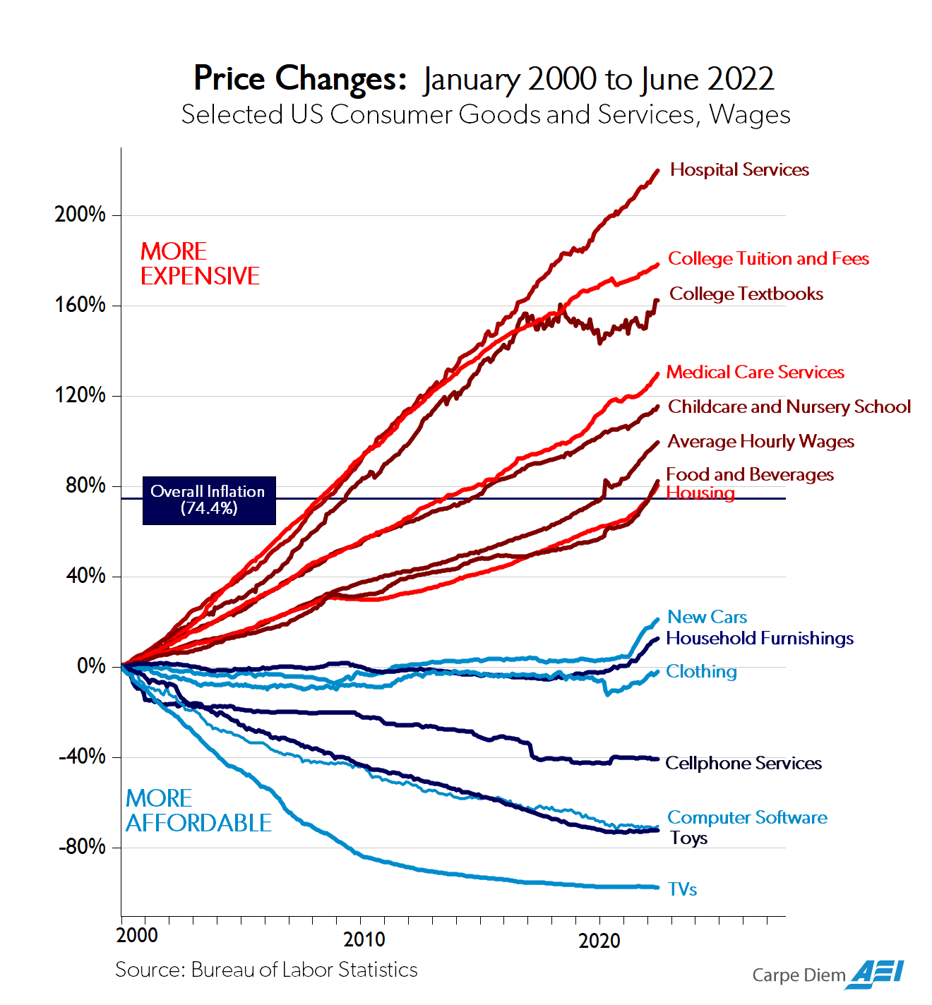
I’ve seen this chart dozens of times and have always enjoyed how many different and important stories it can tell.
There is a story of the incredible abundance offered by technological growth and globalization. Compared to average hourly wages, cars, furniture, clothing, internet access, software, toys, and TVs have become far more accessible than they were 20 years ago. Flatscreens and Fiats that were once luxuries are now commodities.
There is also a story of sclerosis and stagnation. Sure, lots of frivolous consumer goods have gotten cheaper but healthcare, housing, childcare, and education, all the important stuff, has exploded in price. Part of this is “cost disease” where the high productivity of labor in advancing industries like software, raises the cost of labor in slower productivity growth industries like healthcare. Another part is surely the near-universal “restrict supply and subsidize demand” strategy that governments undertake when regulating an industry. Zoning laws + Prop 13 in housing, occupational licensing and the FDA + Medicare in healthcare, and free student debt + all of the above for higher ed.
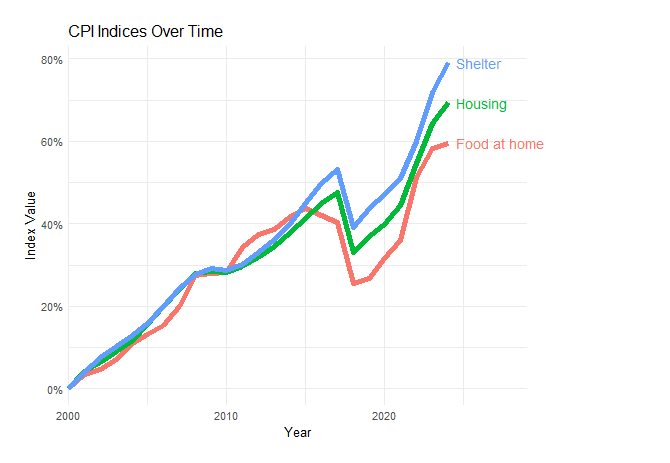
One story from this graph I’ve never heard and only recently noticed is that “Food and Beverages” has inflated just as much as Housing in this graph. This is extremely counterintuitive. Food is a globally traded and mass produced commodity while housing is tied to inelastic land supply in desirable locations. Farming, grocery, and restaurants are competitive and relatively lightly regulated markets while the housing is highly regulated, subsidized, and distorted. Construction productivity is worse than stagnant while agricultural productivity has been ascendent for the past 300 years and even retail productivity is 8x higher than it was in 1950. Construction is also more labor intensive than farming or staffing the grocery.
Yet food prices have risen just as much as housing prices over the past 24 years. What explains this?
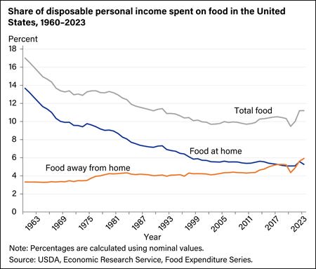
One trend is that Americans are eating out more. The “Food and Beverages” series from the BLS includes both “Food At Home” and “Food Away From Home.” In 2023, eating out was a larger portion of the average household’s budget than food at home for the first time, but they have been converging for more than 50 years.
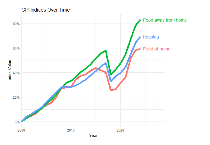
Restaurant food prices have increased faster than grocery prices. This makes sense, as a much larger portion of a restaurant’s costs are location and labor, both of which are affected by tight supply constraints on urban floor space. This isn’t enough to satisfy my surprise at the similarity in price growth though. Even if we just look at “food at home” price growth, it only really sinks below housing after 2015. Beverages at home/away from home follow a more divergent version of the same pattern, but are a much smaller part of the weighted average that makes up the aggregate index.
The BLS series for “Housing” is also an aggregate index of “Shelter” prices, which is the actual rent (or Owner Rent Equivalent), and other expenses like utilities, moving, and repairs. Stagnant construction productivity and land use regulation will show up mostly in rents so these other pieces of the series are masking a bit of the inflation.
There is also changing composition within the “Food at home” category. Americans eat more fats and oils, more sugars and sweets, more grains, and more red meat; all four items that grew the most in price since 2003.
There’s also a flipside to food and beverage’s easy tradability: they’re closer to the same price everywhere. House prices per square foot, by contrast, differ by more than $1000 just across the boroughs of New York City. Over the period tracked by this index there has been massive migration between the most expensive housing states and the cheapest ones. This means the average housing price tracked by BLS gets weighted more towards the Austin housing market as the San Francisco and NYC markets keep rising.
Mike Konczal has a nice breakdown of the BLS indices behind the AEI graph where he shows, among other things, that “Delivery Services” had the highest price inflation of any category over the period, beating out “Hospital Services” by about 10 percentage points. So some of the inflation is due to this cost of trucking and delivery.
These considerations widen the gap between food prices and housing prices, but not nearly as much as the gap between housing and cars or clothing. I’m still pretty surprised by the similarity and I’m not sure why food tracks housing so much more closely than clothing, which seems like a much closer match in terms of supply chain and market structure.
Discuss
