
Published on July 9, 2025 2:30 AM GMT
I recently read an articlewhere a blogger described their decision to start masking on thesubway:
I found that the subway and stations had the worst air quality of mywhole day by far, over 1k ug/m3, ... I've now been masking for aweek, and am planning to keep it up.
While subway air quality isn't great, it's also nowhere near as bad asreported: they are misreading their own graph. Here's where theclaim of "1k ug/m3" (also, units of "1k ug"? Why not "1B pg"!) iscoming from:
They've used the right axis, for CO2 levels, to interpret theleft-axis-denominated pm2.5 line. I could potentially excuse theerror (dual axis plots are often misread, better to avoid) except itwas their own decision to use a dual axis plot in the first place!Hat tip to Evan for pointingthis out in the substackcomments.
The actual peak was only 75 ug/m3 and the subway time averaged below50 ug/m3. While this isn't great, I don't think this is worth maskingover.
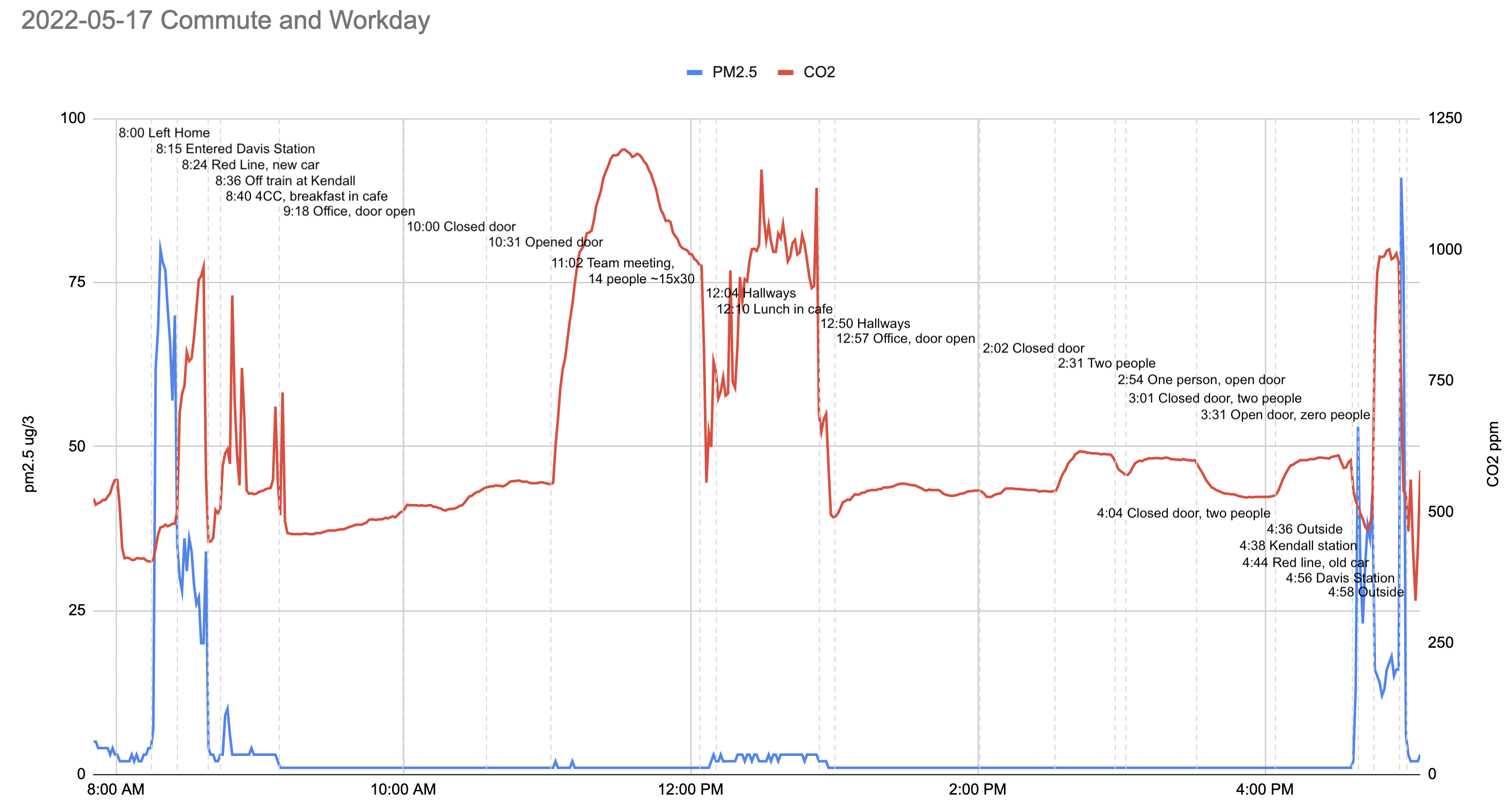
Since I'm making a big deal about this error, though, I wanted to makesure I had my facts straight: I decided to replicate their work. Iused the same meter they used (a Temtop M2000) and took the samesubway journey (round trip from Davis station to Kendall station onthe MBTA's Red Line). To be generous I took my time in the morning,intentionally missing a train at Davis and then lingering in Kendallafter my train departed until the following train had also departed.Here's what I found:

Decent replication! And really not that concerning. Lower particlelevels would of course be better, but I'd wear a mask when cookingbefore I'd wear it on the subway. It's possible that other subways orstations are worse, but I haven't seen evidence of that.
Comment via: facebook, mastodon, bluesky, substack
Discuss
