
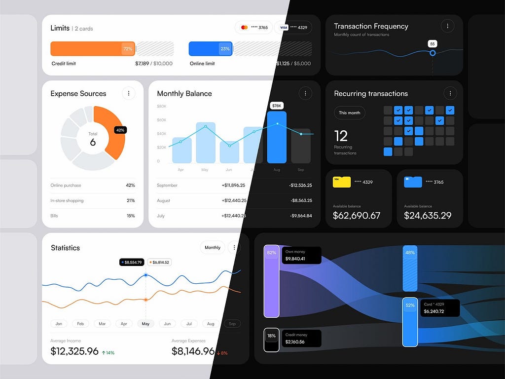
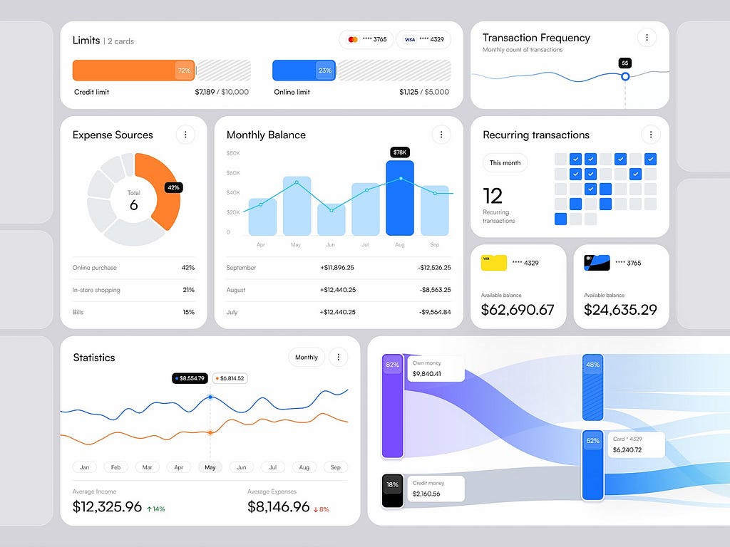
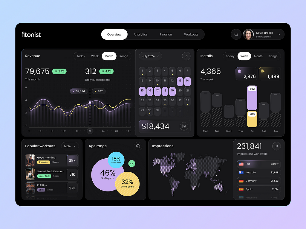
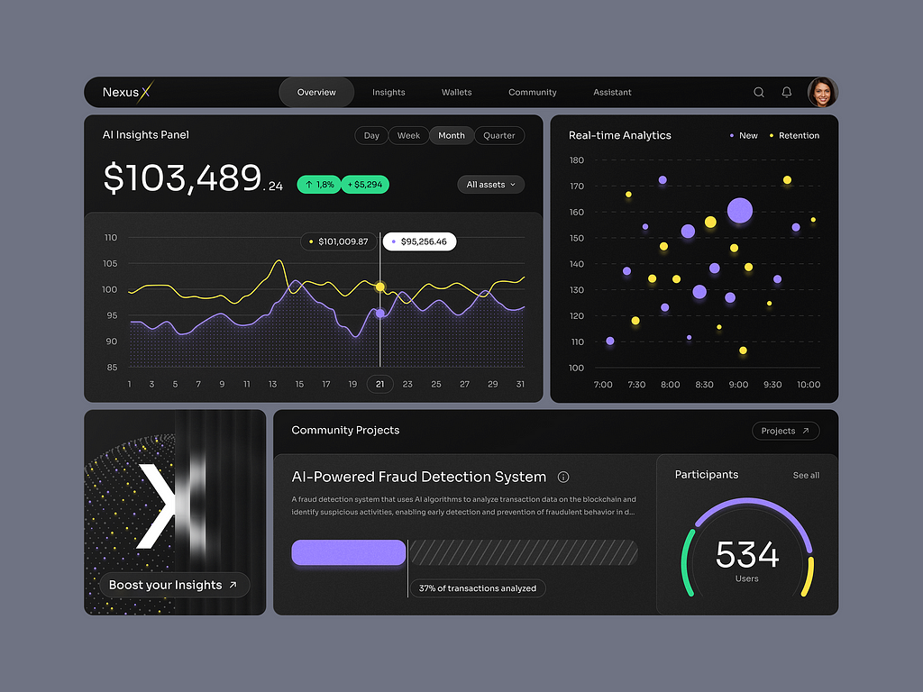
How to plan a dashboard people will use: 10 Key Steps
Our team has built dashboards for a wide range of businesses, and we’ve picked up a few key insights along the way.
If you’re thinking about creating a dashboard, here’s some advice that might save you time, money, and a bit of sanity.
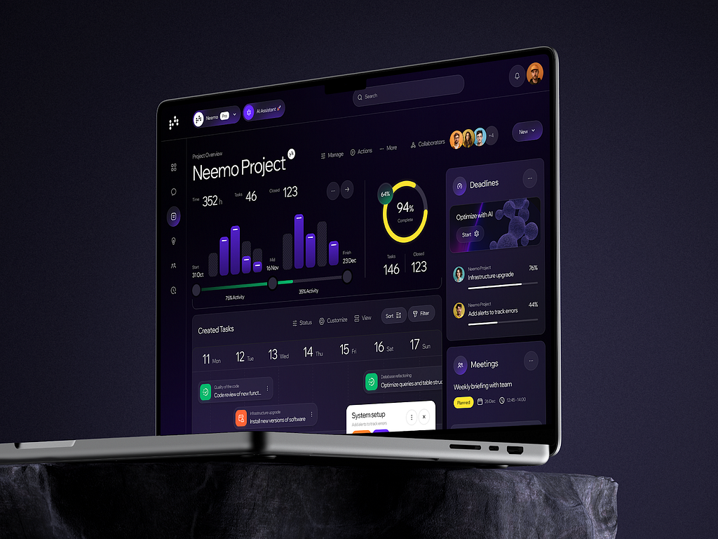
If you want a solid dashboard, treat its design as seriously as you would an airplane’s cockpit. In business — just like in flight — you need to clearly see where you’re heading and how you’re doing before it’s too late to correct course.
A truly functional dashboard is always the result of collaboration. It brings together goals, data, people, and logic. And it’s best built by a team that understands all four — analysts, designers, and developers — who can speak your business language.
Templates and AI tools can help in spots, but they don’t feel your context or see every nuance. In the wrong hands, they can turn a helpful tool into a harmful one. You might track the wrong things and make the wrong calls.
So, if your dashboard is meant for real business — not just fun — bring in specialists who can connect business goals, data, and visual language.
Step 1. Set precise goals
Nailing the right goals and questions is half the battle. The other half is choosing visualizations that answer those questions.
Start by organizing the requirements gathering process for yourself, developers, and designers. Use whatever tool you like (Miro, Trello, FigJam, Google Sheets, Notion, ClickUp, Google Forms).
Create boards, cards, or lists; each one should hold the questions you must answer before handing off tasks. Those answers will help you avoid the biggest dashboard sins: cluttered UI, meaningless metrics, and unused data.
A dashboard should work for the business, not just look pretty.
Step 2. Assemble a responsible team
Decide who owns the dashboard, who builds it, and who will use it.
Don’t try to make a dashboard “for everyone.”
A tool for everyone usually helps no one.
Step 3. Define use cases and users
Spell out the business tasks and map your users. Ask yourself three questions:
- What problems will the dashboard solve?
(e.g., track revenue growth, spotlight funnel bottlenecks, monitor churn)Who makes decisions with this data?
Founder, marketer, product manager?What does each person need to see every day?
Think of a “morning ritual” — what must they grasp in 30 seconds?
It’s not just about roles; habits and convenience matter too.
Step 4. Identify key metrics
Choose 3–5 metrics that truly move your business. Rank them — from top-level to detailed. A bad dashboard shows everything, creating the illusion of control.
Fewer but meaningful metrics are better.
Examples:
- SaaS: Active users, CAC, LTV, churn rate;Marketing: Click-to-lead conversion, customer acquisition cost, ROMI;Finance: Operating profit, average order value, forecasted cash flow.
Step 5. Prepare your data
No good data, no good dashboard. Ask:
- Where is the data stored?How complete and current is it?How will it refresh?Who owns data quality?
Skip manual entry. Automation keeps dashboards alive.
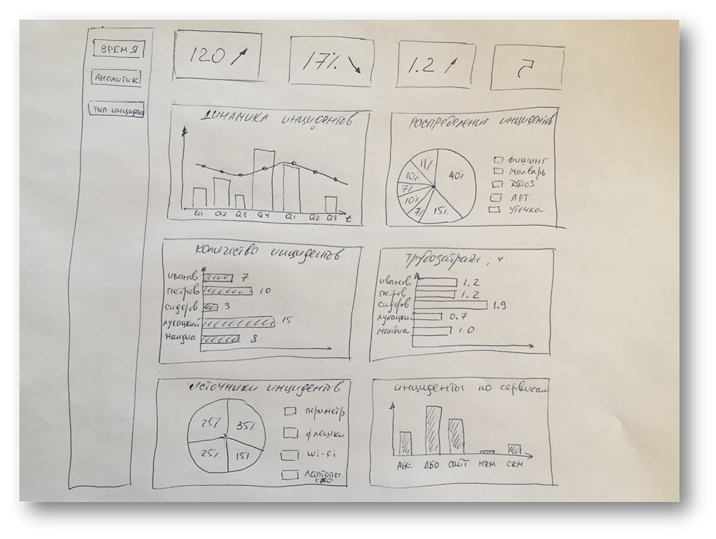
Step 6. Sketch a rough layout
Anything goes — from a napkin sketch to a Figma wireframe. Think through:
- What blocks belong “up top”?Where is the visual focus?What should jump out first?
Ugly is fine — the point is to test structure and ideas.
Step 7. Get user feedback
Show the prototype to real users. Don’t ask, “Is it pretty?” Instead, ask:
- Is it clear at first glance?Does it have enough info to make decisions?What feels missing or extra?
Better to hear “I don’t get it” during drafts than after launch.
Step 8. Write a solid brief for designers
Designers aren’t mind-readers. If you don’t say what matters, they’ll decide for you. Include:
- Which metrics go where and how?Block priority (what’s most important);Mobile vs. large-screen behavior;Color accents, alerts, number formats.
Step 9. Find the right builders
We’d love to say, “Hire us,” but it’s your business and vision. Check portfolios on Dribbble, Behance, and even LinkedIn — talent hides everywhere.
Judge prospects on:
- Business understanding
Pretty charts matter less than knowing why they’re there.
- Interface experience
A dashboard isn’t a landing page; usability comes first.
- Clear communication
If their process sounds fuzzy now, it won’t sharpen later.
- Ability to simplify
Real skill is making complexity feel easy.
- Sense of restraint
A portfolio helps you assess the designer’s style, sense of trends, fit for your type of business, and overall skill and originality.
Most of all, pick the team that digs into your goals.
That’s where the genuine “wow” comes from.
Step 10. Launch. Watch. Improve.
A dashboard is a living system, not a one-shot landing page. After launch, watch:
- How often do people open it?Whether metrics show up in meetings;What trips users up, or what they request next.
No dashboard is perfect on day one. Iterate — improvements pay off.
Conclusion
A great dashboard isn’t just a stack of charts. It shapes the team’s thinking. It directs attention, builds habits, speeds decisions, and saves time instead of stealing it.
Your dashboard becomes priceless when:
- Its purpose is crystal clear;Each role has its own metrics;There’s minimal noise and maximum meaning;You can drill down fast;The team actually uses it.
If that’s the kind of dashboard you’re aiming for, we hope this helps you get started.
As a bonus, here’s a list of AI tools that can be useful when creating business dashboards:

Dashboard That Works: A Step-by-Step Guide for Startups in 2025 was originally published in UX Planet on Medium, where people are continuing the conversation by highlighting and responding to this story.
