Is there some CDF-like equivalent here? Some visualization with no free parameters?
I asked that question to several people at Arbor Summer Camp. I got three answers:
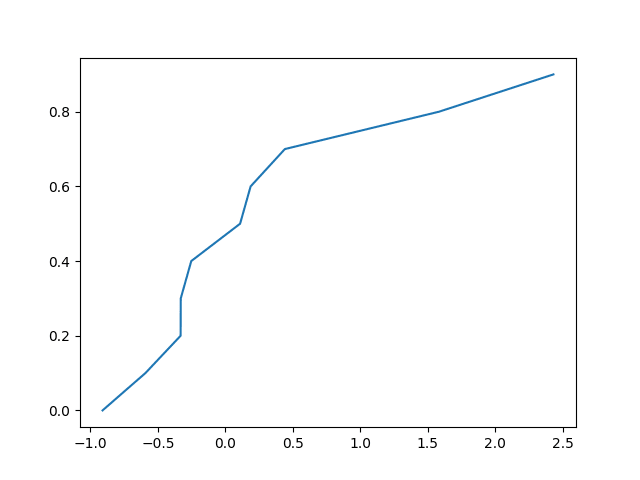
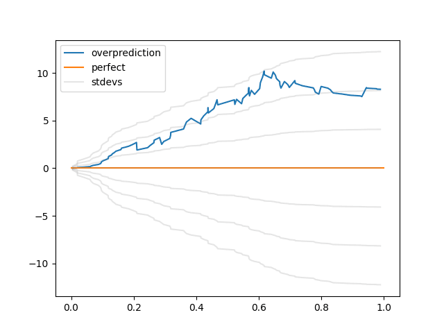
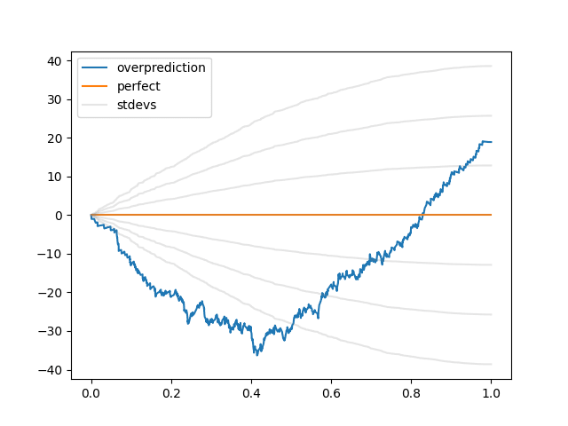
"You get from a PDF to a CDF by integrating. So, here, analogously, let's integrate (num predictions with confidence < x that came true) minus (expected num predictions with confidence < x that came true)."(the same thing, said in different words)(the same thing, said in different words)
If we make a "CDF" for the above 100 predictions by applying these three insights, we get:
I find this a little harder to read than the calibration plots above, which I choose to interpret as a good sign, since CDFs are a little harder to read than histograms. The thing to keep in mind, I think, is: when the curve is going up, it's a sign your probabilities are too high; when it's going down, it's a sign your probabilities are too low.
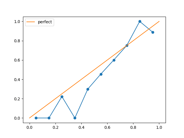
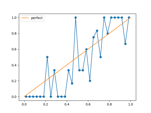
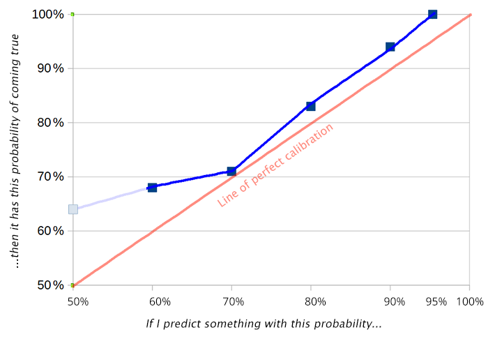
Test: how would you describe the problems that this predictor has?
(Are there any better visualizations? Maybe. I looked into this a couple years ago, but looking back at it, I think this simple "sum(expected-actual predictions with p<x)" graph is at least as compelling as anything I found.)


