
For years, my iPhone’s home screens looked about like this:
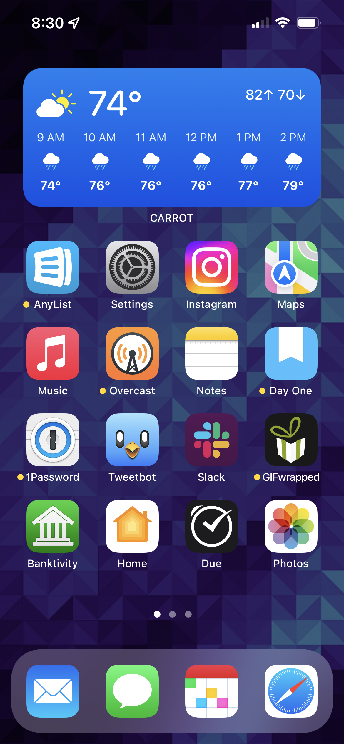
The first screen was the one I used most times. It featured a Carrot Weatherwidget at the top, four rows of icons, and the dock. Maybe ⅔ of the time I used myphone, I was able to do so using this screen. I worked very hard to curate thisscreen.
The second screen was 80% or so of the remaining ⅓ of the time I used my phone.It was mostly curated — I didn’t worry about it quite as much as I did thefirst screen, but I did definitely rearrange things from time to time.
The third screen was a junk drawer, and it looked like it.
Over time, I got really sick of this. Muscle memory let me get to most apps onthe second and third screens quickly, but it just felt… gross. There must be abetter way.
I’m pretty sure it was either in chatting with Myke, or listening to one ofhis shows, that I heard him discuss a different approach. Though he’s not the onlyone to espouse working with your iPhone this way. I had long found this techniqueto be… well… lunacy. But around fall of last year, the idea of it started to reallypull at me.
That approach — that new home screen thought technology — was Spotlight,and the App Library.
Myke discussed how he often uses Spotlight to get to his apps. Said differently, hesearches for them instead of swiping around and tapping on the icon on his home screen.I knew of others who did the same thing, and it always seemed so inefficient andbonkers to me.
But the idea kept eating at me.
The more I thought about it, the more I felt like most of the time I used my iPhonereally was concentrated on a handful of apps. The rest of the time could be any ofthe literally of hundreds of other apps I had on my phone. With my then-currentapproach of every-app-must-live-on-a-home-screen, I was optimizing a ton for appsI rarely needed.
So I ran an experiment.
I decided to rejigger my home screens and take a wildly new [to me] approach.
Here’s what I came up with:
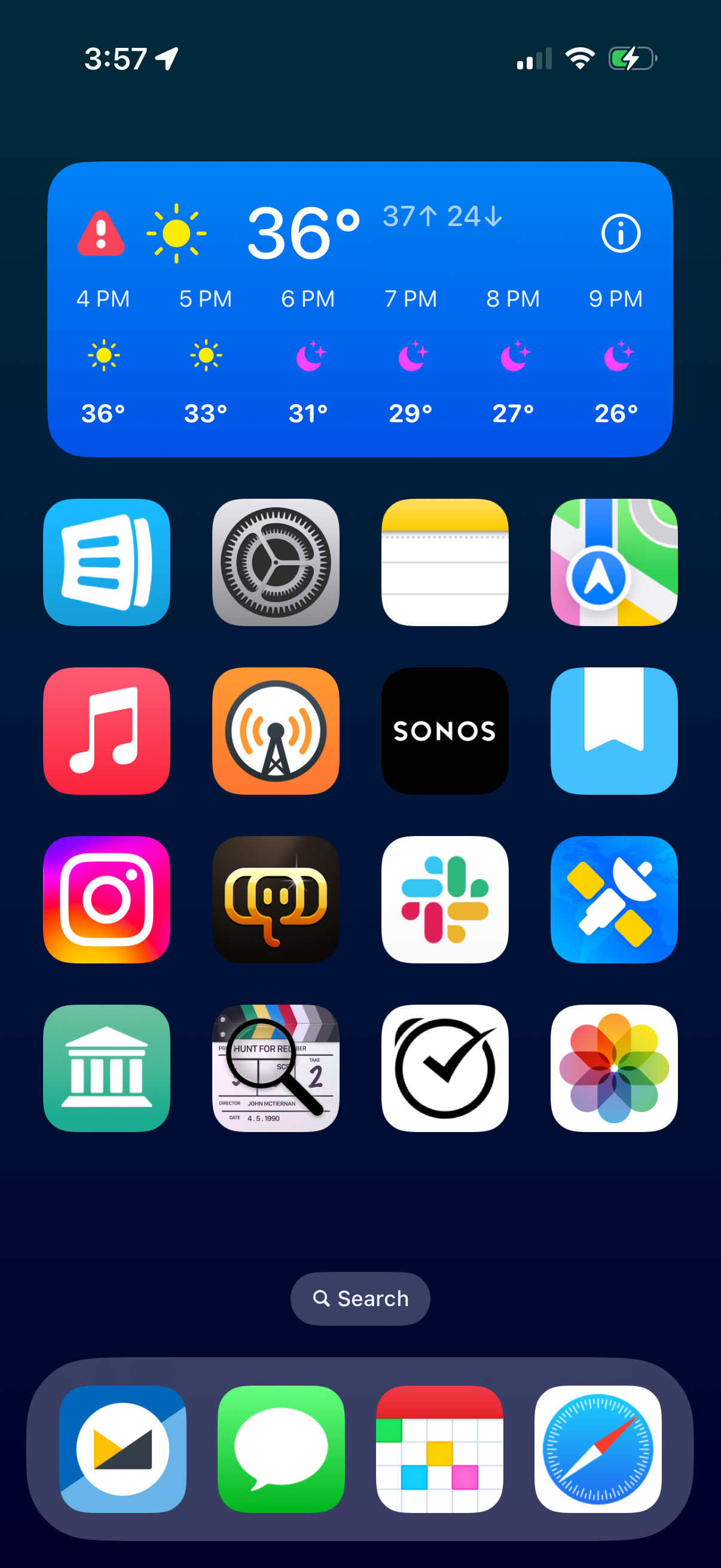
The first home screen looks pretty much the same. There are some minor changes— the images of the old home screens are actually from late summer 2022.However, in broad strokes, it’s the same.
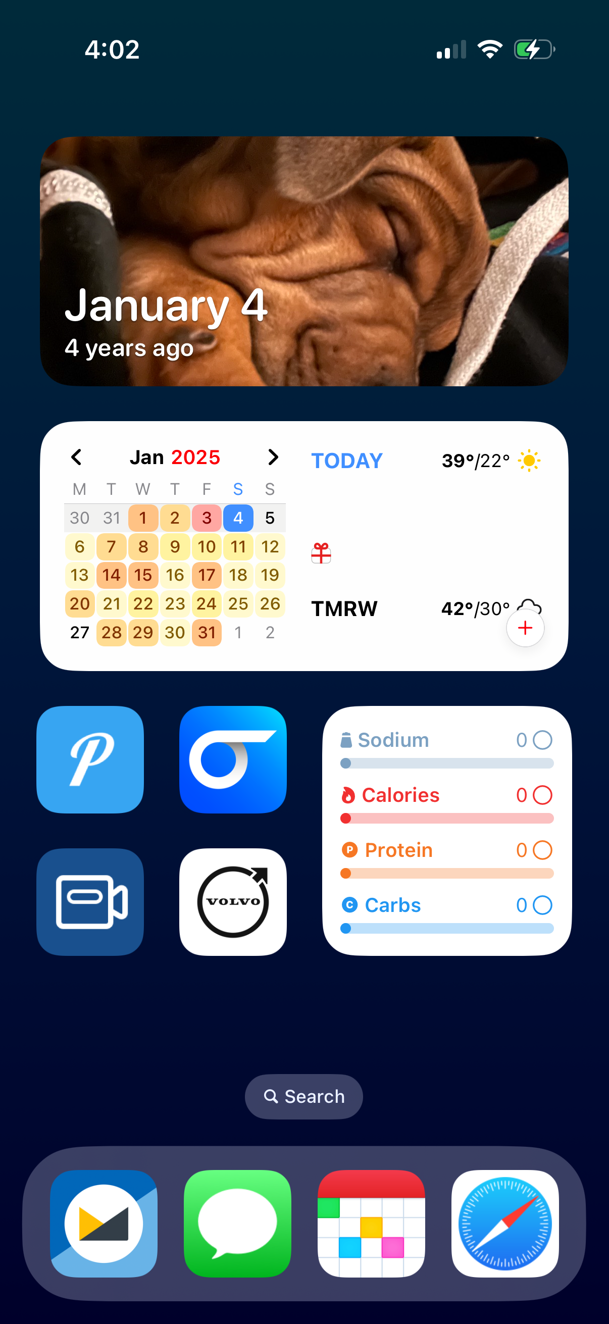
The second home screen is wildly different. There are three slots for widgets:
- The top slot is a stack for photos:
- Widgetsmith’s
On This DayPhotos’ Featured photos widget- Fantastical’s
Event List + Calendar widgetParcel’s Your Deliveries widgetGoals Summary widget.Also on the second screen are four frequently used apps that couldn’t quite makeit to my first screen:
- Pushover, which is an incredible tool for sending yourself push notificationsSports Alerts, which is a no-fuss sports scores app with great Live ActivitiesDS Cam (App Store link), which allows me to see my home security camerasVolvo, which allows me to precondition the climate in Erin’s XC90
There is no third home screen.
The key to this approach is to embrace Spotlight and — to a lesser extent— the App Library.
I didn’t think I’d be able to last this way. I never cared for Spotlight, andalmost never opened the App Library. I generally found them both burdensome.
After a couple of days, I was entirely adjusted. I’m here to tell you that ifI can make it work for me, you can make it work for you, too.
I started with this as an experiment last fall, I’ve come to absolutelylove this approach. I’ve optimized my home screens for 80% usage; about80% of the time, I’m opening one of the apps on one of these two home screens.For the rest of the time, I have Spotlight and the App Library.
Not only has this sped up opening the app I want, it’s also cut down on thenumber of badges I see. While I know I could control that in Settings, it’sa far easier solution to make them just… disappear.
This new home screen thought technology took a long time to really sink in,but once I embraced it, I almost immediately fell in love.
For more on my rationale and journey, you can hear Myke and I also discussthis on Analog(ue) episode #230.
