
Published on August 25, 2024 12:13 AM GMT
Epistemic Status: Old Man Blogs at Cloud
Lately there's been a wave of people on LessWrong (and maybe the whole internet) starting off their essays with some Dall-E3 art.
I don't object (and think it can be cool if done nicely) to get some good ML art to add some visual interest to your posts. But, the default thing I'm seeing is mediocre and making the web feel tacky.
I don't want to just yell at people and make them feel self-conscious about their fun. I have an art background, which means I both have a lot of experience making/evaluating art and also probably have random-ass snooty connoisseurship syndrome. Also I was involved with the fleshing out of the current LessWrong Watercolor Aesthetic, and random clip-art looking images undercut it. (But, to be fair nobody actually voted for or opted into the LessWrong Watercolor Aesthetic, and maybe that's just my problem).
I think not all posts need art. But, if you do want art for your post, here's some hopefully slightly constructive advice/requests.
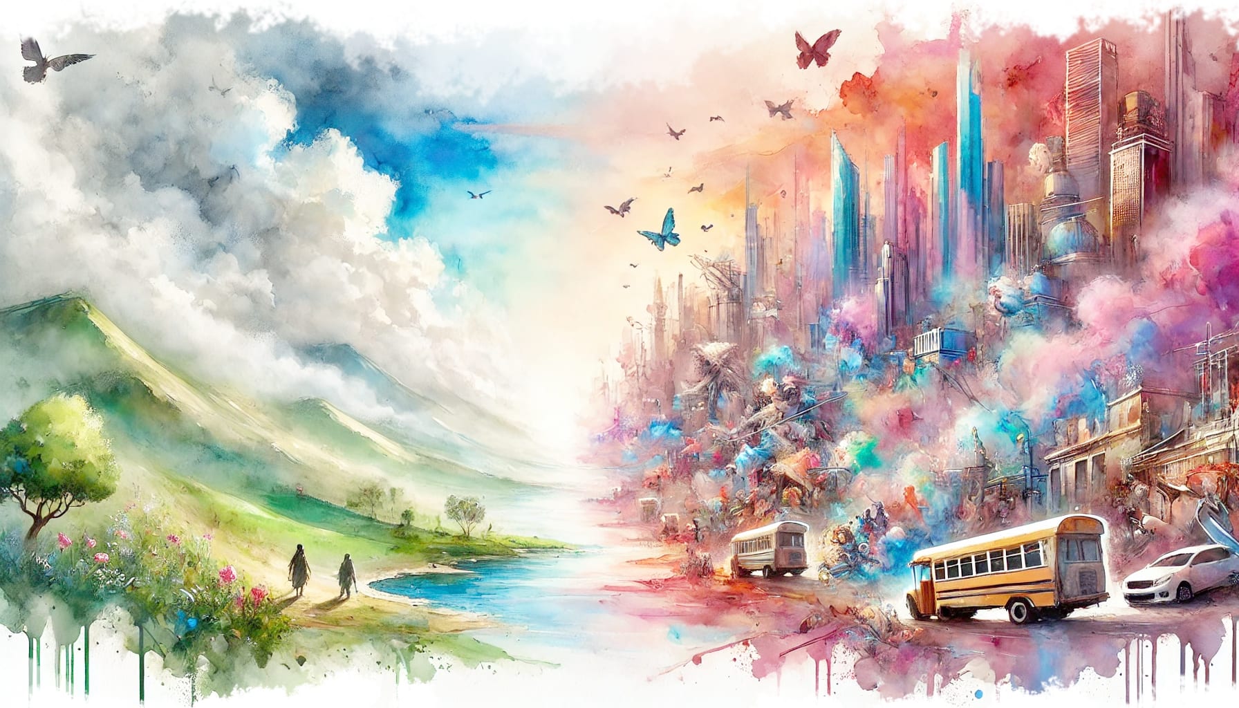
1. Generally, make landscape (widescreen) art.
Most image models output square images by default. This actually fits fairly awkwardly into blogposts – it either takes up a huge amount of vertical space, or you shrink it to fit and then it has weird padding. (The motivating instance for this blogpost was this post, which IMO would be greatly improved if the image was designed to take up more horizontal space).
Sometimes a post makes good use of a very tall art, to set some kind of mood, but it works better for more contemplative posts. (See On Green for an example).
2. Good AI art still takes a fair number of generations and effort.
I'm not sure how many generations people typically do that outputs that mediocre art, but I do want to note, for reference, when I'm making a quick piece of AI art for something (like a facebook event) it still usually involves at least like 5 generations (in Midjourney, where each generation includes 4 options), and often more like 20. And when I'm trying to make actually good art for something I want people to really appreciate (such as the Carving of Reality books), it might be hundreds of generations.
and then some post-processing in photoshop.
3. Think about the mood you want to convey, not just the posts' intellectual content.
Good art sets a tone and helps shift someone into a particular headspace. This doesn't just include the content of the art but the style and color palette.
This is particularly important if you're opening the post with art, where it's setting the very first impression (and is also more likely to show up in the Recent Discussion feed, where it'll look more random).
That's probably not very helpful advice on it's own. Making good art is, like, a whole-ass skill. But, on the offchance you weren't thinking about that at all, maybe giving it at least some consideration will probably help.
Okay, that's it I guess thank you for indulging my rant.
Discuss
