
Published on July 23, 2025 3:05 AM GMT
“There was an old bastard named Lenin
Who did two or three million men in.
That’s a lot to have done in
But where he did one in
That old bastard Stalin did ten in.”
—Robert Conquest
The current administration’s rollup of USAID has caused an amount of outrage that surprised me, and inspired anger even in thoughtful people known for their equanimity. There have been death counters. There have been congressional recriminations. At the end of last month, the Lancet published Cavalcanti et al. which was entitled Evaluating the impact of two decades of USAID interventions and projecting the effects of defunding on mortality up to 2030: a retrospective impact evaluation and forecasting analysis.
This paper uses some regressions and modeling to predict, among other things, that almost 1.8M people are expected to die in 2025 alone from the USAID-related cuts.
I have no love for the administration or many of its actions, but when the world’s foremost medical journal publishes work indicating that a policy’s results will be comparable in death count to history’s engineered mass-starvations by year’s end, I’m going to be skeptical. I’m going to be doubly skeptical when the same work also indicates this policy’s results will be comparable in death count to Maoist China’s policy results by 2030. I’m going to be triply skeptical when similar Monte Carlo modeling has led to inflated and incorrect death count prognostications in the past. And so on.
The BLUF is that the regressions in this paper are likely p-hacked in a way that probably undermines the conclusions. The rest of this post will be a semi-organized cathexis focused on my skepticism.
Regression analysis
The backbone of this paper is a collection of regression analyses. Each is an effort to see how well USAID spend has been statistically related to different measures of mortality by country and over time. In any given year, such an analysis might be fruitless or underpowered; the idea is to use panel data which captures USAID spend over a collection of years and mortality over the same collection of years. In this case they look at 133 countries over 20 years from 2001 to 2021. To the stats mavens out there, this is a panel based Poisson regression analysis with a variety of controls and country-level fixed effects, like this.
This is a complicated analysis, and a lot of technical choices have to be made in order to do it defensibly. Choices like which countries to include, which years to include, which controls to include, how to repair the control variables with missing data, how to deal with exogenous disaster events, which model specification to use, and on and on. It’s choices all the way down. This fact leaves many degrees of freedom that can affect interpretation of the final results.
In mitigation, the authors publish 50 pages of supplementary material to defend the decisions they’ve made. It’s great. I enjoyed reading most of it. It’s better than what many papers do.
In aggravation, and to my slack-jawed disbelief, there is no link to either the flattened data or the code used to produce the regression analyses or the figures. The team of authors is large and they needed to share code and data and stuff. A code repository almost certainly exists for this project and still it remains hidden. In the following sections where I attempt a partial replication, I had to go get and process the data elements myself, and I kind of resent it.
Rant over. For several USAID targeted causes of death, the authors report a collection of regressions as described above and arrive at their Figure 1.
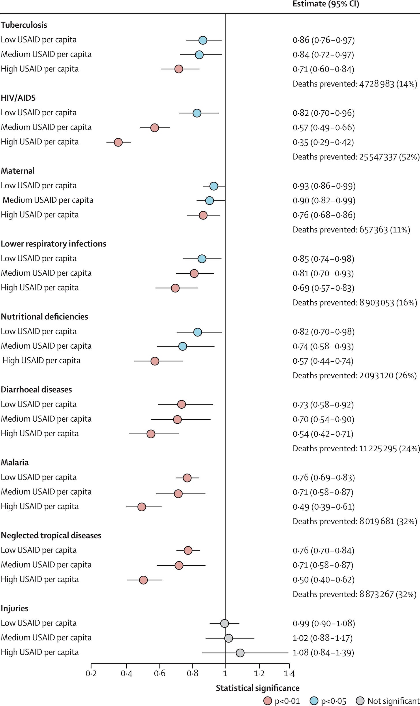
So each dot is a regression coefficient corresponding to a rate ratio. For example, the first row implies “Low USAID per capita spend is estimated to decrease Tuberculosis mortality by 100 - 86 = 14%, and that result is significant at the p < 0.05 level”. The striking sixth row implies “High USAID per capita spend is estimated to decrease HIV mortality by 100 - 35 = 65%, and that result is significant at the p < 0.01 level”.
I have done regressions like this on real world data for a long time. This isn’t some toy dataset you’d use in a college problem set; it’s created from diverse and disparate data sources. I don’t know how else to say this, but practitioners who work on such data know that nothing works as cleanly as this the first time you do it, and probably not even when you refine the technical choices iteratively. The results are always noisier and less significant than you’d prefer.
Everything in this alarming figure is significant except for the sanity test regression they use at the bottom. Each of the eight regressions has the perfect, expected ordering between high, medium, and low levels of spend!
Remember, they’re using mortality data that specifically and intentionally comes from the poorer countries where USAID had a large footprint. The Bird recently wrote a great piece about how such countries lack the capacity to collect data effectively and it’s a huge problem in the developing world. The WHO even has a specific webpage about data quality and a tool allowing you to see how bad some of the data quality is in poor countries.
In the FAQ they allege this explicitly.
… In many low-resourced countries, the cause-of-death information is difficult to obtain, mainly because the system for recording such information is not functioning or inexistent. In addition one of the big problems is the lack of medical certifiers to complete the death certificates.
Look, suppose none of this is true. Suppose the WHO is wrong and the GBD mortality data quality in these regressions is fine, and further suppose that the USAID spend really was very effective at mortality reduction in the ways the regressions above work. Suppose that in each regression there was an 80% chance of the high > medium > low pattern holding in mortality reduction. Assuming some kind of independence of the disease mortality and individual regression analyses, you’re still only going to see this pattern .8 ^ 8 = 16.7% of the time.
What’s going on here?
I was sufficiently suspicious of this that I actually did a last digit uniformity test on some of the rate ratio statistics. web15Values are from Web Figure 15 in the supplemental material, which are the same ones reported in Figure 1.
> web15Values [1] 0.856 0.821 0.926 0.852 0.825 0.732 0.761 0.765 0.988 0.838 0.568 0.899[13] 0.808 0.736 0.701 0.710 0.711 1.016 0.710 0.348 0.762 0.689 0.570 0.545[25] 0.490 0.497 1.082> > last_digit_test <- function(x, decimal_places = 3) {+ scaled <- abs(round(x 10^decimal_places))+ last_digits <- scaled %% 10+ + observed <- table(factor(last_digits, levels = 0:9))+ expected_probs <- rep(0.1, 10)+ names(expected_probs) <- 0:9+ + chisq <- chisq.test(observed, p = expected_probs, rescale.p = TRUE)+ + list(+ last_digits = last_digits,+ observed_counts = observed,+ expected_counts = round(sum(observed) expected_probs),+ chisq_statistic = chisq$statistic,+ p_value = chisq$p.value,+ test_result = ifelse(chisq$p.value < 0.05,+ "Significant deviation from uniformity",+ "No significant deviation from uniformity")+ )+ }> > last_digit_test(web15Values)$last_digits [1] 6 1 6 2 5 2 1 5 8 8 8 9 8 6 1 0 1 6 0 8 2 9 0 5 0 7 2$observed_counts0 1 2 3 4 5 6 7 8 9 4 4 4 0 0 3 4 1 5 2 $expected_counts0 1 2 3 4 5 6 7 8 9 3 3 3 3 3 3 3 3 3 3 $chisq_statisticX-squared 11.14815$p_value[1] 0.2656907$test_result[1] "No significant deviation from uniformity"
So this test was fine, and probably excludes the possibility that people are literally just making up numbers.
A partial reproduction
I did attempt a partial reproduction of the results in this paper. The supplementary material contains a lot of discussion around robustness of the results to changes in the modeling decisions. Unfortunately, with no code or flattened data, there’s no way of actually testing this directly and you have to start from scratch. This section will be devoted to a significantly simpler model specification than what the authors used. The goal here is not a faithful reproduction. It’s way too much work for me to go find and recreate all of the 18(!) control variables they use.
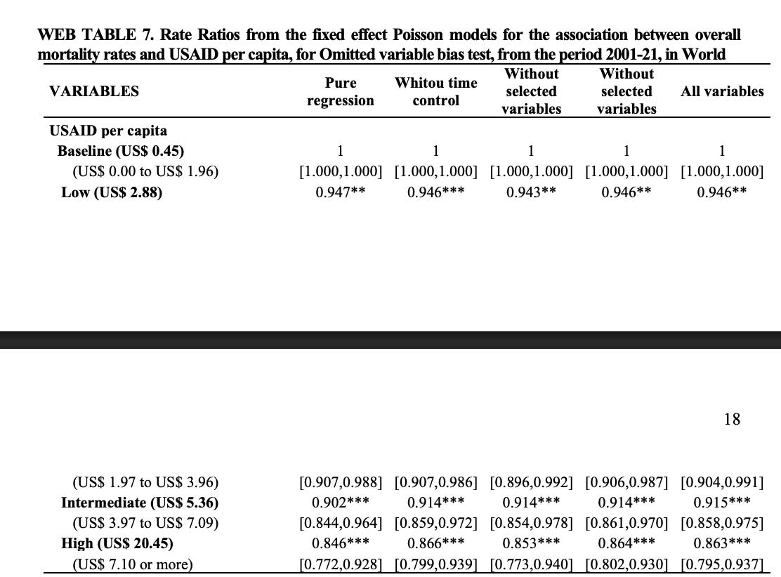
Instead the idea to determine the sensitivity of the analysis of some of the modeling decisions. To keep this simple, for the rest of this section we’ll be regressing all-cause mortality on the USAID per capita spend variables, as done in Web Table 7, pages 17 and 18 in the supplementary material. There will be no controls or dummy variables, and the spec will be thereby simplified as
The code and data I used in the rest of this analysis is checked in here.
Choice to use categorical spend exposures
In the paper’s regressions, you’ll notice that a variable like per_capita_spend does not appear. There are only a collection of variables like high, medium and low USAID spend. This is because the authors chose to bucket the per capita spend statistics into quartile buckets. On this subject they state
… we chose to use categorised variables for several reasons. First, they provide more understandable and actionable implementation thresholds, which are valuable for policy-making purposes. Second, they help mitigate the influence of over-dispersed values or outliers in the existing or extrapolated data for the independent variables, including the main exposures and covariates. Third, and most importantly, when the main exposure variable is a categorical dummy with multiple levels, it allows for a clearer evaluation of the dose-response relationship between the exposure and outcome variables, particularly when the relationship is non-linear. In this context, the dose-response analysis explores how varying levels of USAID per capita (the “dose”) correspond to changes in age standardized mortality rates (the “response”). This approach, commonly used in epidemiology and public health helps assess whether higher program coverage results in progressively stronger effects, providing further evidence for a causal interpretation of the statistical associations.
I don’t really agree with any of this. I get they’re writing for an epidemiological, policy-based audience, but that audience agrees with them the USAID cuts are terrible regardless of the model spec. They’re also writing to suggest the USAID cuts amount to 7-figure mass murder, so you don’t take shortcuts when doing the statistics just because it’s easier to understand. There are better ways to deal with outliers and overdispersion than crude feature binning that can introduce arbitrary threshold effects.
As for the “causal interpretation”, a dose-response curve only sort of bolsters the case for the More USAID spend → Less Death model of causation. It’s also consistent with a More Death → More USAID Spend model of causation where spend is increased to deal with serious mortality crises.
This is a difference of opinion though; what does their choice to bin the variables this way actually do?
We chose to use a categorical exposure variable, while also verifying that similar effects were observed when using a continuous exposure variable as well as multiple alternative categorizations.
I ran this with a continuous exposure variable (no binning) and obtained Regression 1
REGRESSION 1GLM estimation, family = poisson, Dep. Var.: all_cause_deathsObservations: 2,393Offset: log(population)Fixed-effects: location_name: 129Standard-errors: Clustered (location_name) Estimate Std. Error z value Pr(>|z|) per_capita_spend -0.00456 0.002062 -2.2118 0.026981 * ---Signif. codes: 0 '' 0.001 '' 0.01 '' 0.05 '.' 0.1 ' ' 1Log-Likelihood: -5,553,128.5 Adj. Pseudo R2: 0.993703 BIC: 11,107,268.4 Squared Cor.: 0.994744
Ok, so maybe there is some there there. What does it look like with the quartile binning?
REGRESSION 2GLM estimation, family = poisson, Dep. Var.: all_cause_deathsObservations: 2,393Offset: log(population)Fixed-effects: location_name: 129Standard-errors: Clustered (location_name) Estimate Std. Error z value Pr(>|z|) is_q2_overalltrue -0.034951 0.032242 -1.08402 0.278354 is_q3_overalltrue -0.109977 0.054841 -2.00538 0.044923 is_q4_overalltrue -0.145172 0.058856 -2.46655 0.013642 ---Signif. codes: 0 '' 0.001 '' 0.01 '' 0.05 '.' 0.1 ' ' 1Log-Likelihood: -5,464,362.6 Adj. Pseudo R2: 0.993803 BIC: 10,929,752.1 Squared Cor.: 0.994984It looks a slightly better fit from a BIC perspective. The second quartile drops from significance and the third quartile is barely significant. Overall, this is still a much weaker result than what they report, but the binning itself doesn’t change a lot about the regression.
I actually had trouble getting this far. When I did the binning initially, my quartiles kept coming out much different than what the authors had calculated. I finally realized that they must have binned them not per year but across the entire data. Regarding how this quartile binning was done, the authors state in the supplemental material that
𝑈𝑆𝐴𝐼𝐷𝑞𝑖𝑡 are the USAID per capita in categories (quartile, 4 groups) observed at the country 𝑖 in year 𝑡, with associated coefficients 𝛽𝑞.
I took this to mean per year binning, but it’s not. They must have done it over the entire dataset because this is what happens when you do the per year binning.
REGRESSION 3Observations: 2,393Offset: log(population)Fixed-effects: location_name: 129Standard-errors: Clustered (location_name) Estimate Std. Error z value Pr(>|z|) is_q2_by_yeartrue -0.019768 0.027025 -0.731459 0.46450 is_q3_by_yeartrue -0.070492 0.043942 -1.604206 0.10867 is_q4_by_yeartrue -0.062096 0.045470 -1.365638 0.17205 ---Signif. codes: 0 '' 0.001 '' 0.01 '' 0.05 '.' 0.1 ' ' 1Log-Likelihood: -5,606,919.6 Adj. Pseudo R2: 0.993642 BIC: 11,214,866.2 Squared Cor.: 0.994695Suddenly, the results become confused and unpublishable with this spec.
I’d pretty sure the choice to do per year binning is correct. They explicitly chose not to include year-based fixed effects so any trends in funding levels are not correctly handled if you do it over the entire dataset. The per year binning also torpedoes their results.
Choice to use Poisson
Throughout this paper, the authors use Poisson regression to model the country level mortality. In lay terms, this sort of assumes deaths happen independently of each other and at a predictable rate. Obviously, USAID intentionally operates in parts of the world where Death might be omnipresent, joined by his three companion horsemen Conquest, Famine, and War who don’t necessarily respect statistical independence.
But ignoring this notion, Poisson is standard for something like this, and I don’t blame the authors for defaulting to this spec. However, given the noise in this mortality data I wondered whether it would be better to use a negative binomial regression, and the authors wondered the same thing.
Although the Negative Binomial model is a generalization of the Poisson model and accounts for overdispersion, it also requires the estimation of an additional dispersion parameter, making it a less parsimonious alternative. In our case, the Poisson model yielded lower AIC and BIC values compared to the Negative Binomial model, indicating a better balance between model fit and complexity. Therefore, we retained the Poisson specification.
In a bizarre technical twist, the BICs for negative binomial and Poisson models as implemented in R are incomparable. The authors worked in stata and I’m sure as shit not paying for that to do a replication. I can’t easily confirm that the Poisson BIC was better than the negative binomial BIC, but a few things about this are noteworthy. The Poisson regression summary I did is Regression 2 above. Compare this to the corresponding negative binomial regression
REGRESSION 4ML estimation, family = Negative Binomial, Dep. Var.: all_cause_deathsObservations: 2,393Offset: log(population)Fixed-effects: location_name: 129Standard-errors: Clustered (location_name) Estimate Std. Error z value Pr(>|z|) is_q2_overalltrue -0.019435 0.026313 -0.738613 0.46014 is_q3_overalltrue 0.004617 0.035427 0.130325 0.89631 is_q4overalltrue -0.054367 0.040008 -1.358915 0.17417 ---Signif. codes: 0 '' 0.001 '' 0.01 '' 0.05 '.' 0.1 ' ' 1Over-dispersion parameter: theta = 44.07691 There are a few salient things to note about this comparison between Regression 2 and Regression 4.
First, the NB regression theta indicates mild to moderate overdispersion, so all other things equal, NB is probably going to be better. But unfortunately for the authors, look at the p-values! Such a regression would completely blow up their results. Nothing is significant at all.
Second, the rate ratios in the NB regression are much smaller than the authors report in Web Table 7 and in the Poisson regression.
Third, you do see the expected ordering of the spend quartile variables in the Poisson regression so maybe there is some there there, but it’s messier in the NB regression.
Fourth, from a personal perspective, the piece of crap NB model is much more like what I’d expect to see on messy real world data like this.
In this circumstance, both choices are probably defensible with NB probably being marginally better, but naturally they went with the methodology making the results impressive. Make of that what you will.
Choice of countries
The authors chose to exclude high income countries from the regression. I concur, and that’s what I did in the above sections. However, I did want to see how sensitive the result in Regression 1 was to changes in the country composition among the countries I used.
I ran a quick 1000 model simulation randomly dropping 10% of the low income countries from the dataset and tracking what the p-values and spend coefficients looked like.
<a href="https://substackcdn.com/image/fetch/%24s!OMEa!,f_auto,q_auto:good,fl_progressive:steep/https%3A%2F%2Fsubstack-post-media.s3.amazonaws.com%2Fpublic%2Fimages%2F4eb27a33-6d74-47f9-8af6-a58b1e2bcfdd_2152x892.png">
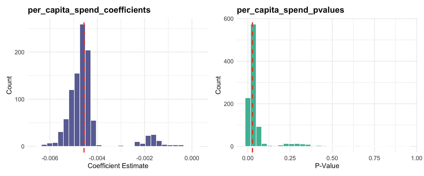
The red lines are the coefficient and p-value from Regression 1. I couldn’t check the exact 133 countries the author’s used (I only ended up with 129, which was probably because we bucketed the income levels slightly differently) but there’s nothing egregious here. It is interesting that when you drop the correct set of countries in these regressions, the spend effects basically go to zero, but this doesn’t happen very often.
This indicates quite a bit of robustness to different country selection, so no complaints there.
Coda
The weird thing about this paper is its relation to Regression 1. In my reproduction that doesn’t have a gazillion controls, there is a significant relationship between per capita USAID spend and overall mortality. For whatever reason this wasn’t enough and some of the choices they make to strengthen the result end up being counterproductive. In both the categorical binning issue and the choice to use Poisson, the alternative choices make the results null, which I consider to be fairly strong evidence of p-hacking.
Even so, without the controls, I could not make a result nearly as strong as what’s reported. It is possible that the controls they use make all of the exposure variables much more significant, but that’s not been the case in my experience. If you need to use a ton of controls to get there, the underlying relationship probably isn’t strong as you believe.
A weak result isn’t actually that controversial. Other modern studies using similar methods have come to that conclusion.
On a non-statistical note, maybe I lack imagination, but it simply isn’t believable that millions of people are going to die because of USAID’s demise. Even though it’s published in the Lancet, please reserve judgement.
Discuss
