What the latest generation of AI tools means for the product design process; what these tools bring to the table, where they fall short and how to leverage them to up-level our craft.
In recent years, we’ve seen a noticeable shift in how digital products get built. Most products today are built using AI assistance at every point in the product life cycle. Whether you are writing product requirements, translating those requirements into a visual experience, or actually coding the damn thing, AI is there to help.
And the numbers back it up. According to Gartner, 70% of new applications will be developed using low-code or no-code platforms by 2025, up from less than 25% in 2020. Meanwhile, the global UI/UX design tools market is projected to grow at a CAGR of over 20%, reaching $18.6 billion by 2028. Taken together, these stats signal a shift not just in tooling, but in the structure of how teams work.
What does that mean for product teams?
It used to be that roles were cleanly separated. PMs handled specs. Designers owned the look and feel. Engineers built the thing. The tools reflected that separation. Figma was for design. VS Code was for implementation. No-code tools mostly lived in marketing departments.
But that separation is eroding.
Tools are becoming multi-purpose. Designers are wiring up logic. PMs are tweaking layouts. Engineers are working with auto-generated UIs. And AI is starting to do all three.

The boundaries between PM, design, and engineering are shifting — and fast.
In place of clearly defined roles, we’re seeing a growing need for cross-functional fluency and full stack awareness — a shared understanding of how things are scoped, structured, designed, and shipped. That’s no longer a nice-to-have. It’s becoming foundational to building products in 2025.
And one of the clearest places we’re seeing that shift?
UX generation.
There are now a wave of tools promising to help you go from idea to working screen — fast. The promise is speed, but also clarity: fewer handoffs, better alignment, and tighter feedback loops between what’s initially imagined and what actually gets built.
So I decided to try a few of them myself.
I picked four tools that each take a different approach to AI-accelerated UI creation:
- CursorUX PilotFigma (AI Assist, Make, and Dev Mode)Google Stitch
In each one, I built the same product case— one with real interaction complexity, not just basic landing page layouts.
The goal?
The goal here is threefold: first, to map the edges of what’s actually possible with AI-assisted UI tools today — not just the hype, but the hands-on limits. Second, to surface emerging best practices that other designers and builders can learn from or build on. And third, to start sketching a vision for what the next generation of design tools should do — where they need to go if they want to truly push the field forward.
Let’s get into it.
The Product Case
What We’re Building: User Behavior Simulator for Product Testing
Problem Context: Product teams often struggle to predict how real users will interact with a new interface. Traditional user testing typically happens after launch, making it expensive and risky to fix usability issues post-release. Early design prototypes lack behavioral context, leading to blind spots in UX decisions.
User Needs
- Simulate user behavior during the design or prototype phaseIdentify friction points and drop-off risks before developmentTest experiences for diverse user types (e.g., accessibility, intent, mindset)
Rough User Journey
- Upload or connect a prototype (e.g., Figma, live URL)Create or select personas with intent and behavior traits (e.g., “mobile-first shopper,” “hesitant new user”)Define a user goal or task (e.g., “find a product and complete checkout under $20”)Simulate user actions — AI agents mimic realistic user behaviorReview behavioral insights: Heatmaps, Bounce points, Confusion clicks or rage taps, Success/failure pathsIterate on design to resolve detected issues
Jobs To Be Done
- “When I’m designing a new user flow, I want to simulate different user behaviors so I can catch potential UX pitfalls before launch.”“When I’m evaluating a prototype, I want automated feedback on drop-offs and confusion points so I can prioritize what to fix.”“When I’m validating a design, I want to stress-test it with different user personas so I ensure accessibility and inclusivity.”
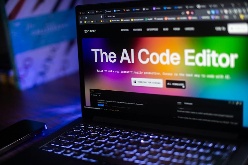
Building with Cursor
Cursor positions itself as an AI-native code editor, but it’s more than that. It’s essentially a full-stack pair programmer designed to sit inside your development environment.
For this experiment, I used Cursor to build the entire backend and frontend architecture for a user behavior simulator — starting from the following prompt:
### 🧪 Use Case: User Behavior Simulator for Product Testing

#### 1. Problem Context

Product teams often struggle to predict how real users will interact with a new interface. Traditional user testing typically happens *after* launch, making it expensive and risky to fix usability issues post-release. Early design prototypes lack behavioral context, leading to blind spots in UX decisions.

#### 2. User Needs + Pain Points

**Needs:**

* Simulate user behavior during the design or prototype phase
* Identify friction points and drop-off risks before development
* Test experiences for diverse user types (e.g., accessibility, intent, mindset)

**Pain Points:**

* Static prototypes don’t show interaction flow or failure points
* Manual testing is time-consuming and often misses edge cases
* Analytics only reflect issues after they’ve already impacted users

#### 3. Rough User Journey

1. Upload or connect a prototype (e.g., Figma, live URL)
2. Create or select personas with intent and behavior traits (e.g., “mobile-first shopper,” “hesitant new user”)
3. Define a user goal or task (e.g., “find a product and complete checkout under \$20”)
4. Simulate user actions—AI agents mimic realistic user behavior
5. Review behavioral insights:

   * Heatmaps
   * Bounce points
   * Confusion clicks or rage taps
   * Success/failure paths
6. Iterate on design to resolve detected issues

#### 4. Jobs To Be Done

* *"When I’m designing a new user flow, I want to simulate different user behaviors so I can catch potential UX pitfalls before launch."*
* *"When I’m evaluating a prototype, I want automated feedback on drop-offs and confusion points so I can prioritize what to fix."*
* *"When I’m validating a design, I want to stress-test it with different user personas so I ensure accessibility and inclusivity."*
Within seconds, Cursor scaffolded a full working prototype, including:
- A Flask backend with routes for persona management, simulation control, and analyticsA SQLite database and model classes for users, personas, and simulation runsA Selenium-powered engine to simulate actual user interactions in the browserFrontend templates using Jinja for dashboards and heatmapsSetup files, a requirements.txt, and detailed docstrings throughout

Where it struggled most was deployment.
The generated code assumed a local dev environment. Once I tried to deploy it to Render, I hit multiple packaging and Python compatibility issues. Debugging those required a shift back to manual work: pinning dependency versions, downgrading Python, and creating a runtime.txt file Render would actually recognize.

Still, the core development speed-up was undeniable.
Below is a quick snap shot of the interactive prototype that I was able to build in just under a few hours (most of which was spent figuring out the deploy).


Taking a closer look at the end result, here’s what stood out to me about the process.
How it helped the design process
- It validated core assumptions early. Right away, I was able to test the hypothesis that the primary user goal would be to create personas and run simulations — something that would’ve taken much longer to confirm in a traditional workflow.It exposed where the specs needed tightening. I had loosely defined what the analytics layer should include — heatmaps, click traces, rage taps — but the prototype made it clear that without a strong information design model, those outputs wouldn’t be actionable.It made friction points visible. Because the simulator mimicked actual interactions (clicks, scrolls, navigation paths), I could see exactly where things broke down or felt unintuitive — before writing a single line of production code.
Where it hindered it
- Iteration felt heavy. Whether I was adjusting layout structure or just fine-tuning visual details like font weights or colors, every change kicked off a full cycle: tweak the code in Cursor, push the update, debug the deploy, then manually test it in the prototype. Quick visual experiments weren’t exactly quick.The UI had a throwback vibe — and not in a good way. The default styles felt dated, with bright primary colors and clunky font choices that reminded me more of early-2000s desktop apps than modern product UIs.Deployment wasn’t plug-and-play. While Cursor handled local development well, getting the project live on Render introduced a whole new layer of complexity — version mismatches, wheel build errors, and obscure Python packaging issues that had nothing to do with your actual product logic.AI sometimes over-engineered things. Cursor was impressive in how much it scaffolded, but some of that scaffolding added overhead. For example, generating folders like simulator/ and models/ with formal class structures was great for clarity, but made simple changes feel unnecessarily complex when you just wanted to test a quick idea.
Building with Google Stitch
Google Stitch is an experimental UI design tool that combines natural language prompts with generative design. It uses a split interface: a chat panel where you guide the build process conversationally, and a canvas where your designs are auto-generated in response.
Setup is fast — but not hands-off.
I started by entering a prompt describing the product I wanted to build, switched to Web mode, chose a model, and hit generate. Stitch’s first auto-reply was a suggested command — “Make all screens” — which kicked off the build process.

The canvas builds out full flows, not just isolated screens.
Clicking that command triggered a loading state on the canvas. Once ready, it produced a complete multi-screen flow that closely matched what I had described — layouts and overall hierarchy included.

The chat is context-aware and proactively guides the build.
Once the screens were generated, the chat reflected that and followed up with smart prompts like “Want to add this feature?” or “Want to detail out this page?”. The back-and-forth felt intelligent, as if it anticipated what I would ask.


Every new chat input spins up a new canvas.
Each clarification or request created a fresh canvas instance, which helped with versioning but also made it a bit harder to manage continuity. It’s powerful, but you have to keep track of where each version lives.

Taking a closer look at the end result, here’s what stood out to me about the process of building with Stitch.
How it helped
- Fast, context-aware iteration through chat. The chat-canvas interface made it easy to reference specific screens and request changes directly , for example, “can you show me what the heat map tab would look like?” — Stitch understood the context of the flow and applied edits efficiently.High visual polish out of the box. The generated screens were production-grade — clean layouts, consistent spacing, and solid visual hierarchy. The stock photos of the personas, for example, felt meaningful and visually pleasing. It didn’t feel like a rough draft.Flexible inputs and easy overrides. Defaults were editable through chat adn a settings panel in the top right hand corner — changing things like layout types, content structure, or component styles was as simple as rephrasing the ask or clicking a few buttons.
Where it hindered
- Noticeable latency slowed momentum. There was a lag between prompt and output — especially with complex flows — which interrupted creative flow and made quick experimentation harder.Multiple canvases created versioning friction. Every chat turn spun up a new canvas. While this helped with branching, it made it harder to track progress or unify edits across versions.Stuck in form-mode thinking. Even after prompting for more visual creativity or layout variation, Stitch leaned heavily on structured, form-like screens. For instance the persona creation screen indexed heavily on collecting all user inputs through a classic form UI — limiting the expressiveness of the design output.
Building with Figma AI Features
AI First Draft generates a single screen — but doesn’t always hit the mark.
AI First Draft lives inside the design canvas as a plugin. I entered a prompt describing the product I wanted to explore, and within seconds it generated a screen. But instead of a core product interface, it gave me a polished marketing site. Visually, it was solid, but functionally it missed the intent. It’s a one-shot tool — no follow-up chat, no iteration path — so once the screen is made, you’re left editing by hand.

Figma Make offers a more structured way to prototype via prompt.
Figma Make lives in its own canvas type — separate from traditional design files — and feels closer to a prototyping playground with code previews. I started with a text prompt describing my product and after some time, Make delivered a functional wireframe prototype.


The output is interactive but leans low-fidelity.
The prototype came with clickable elements and basic flows, but visually it was mid-fi at best — gray boxes, placeholder text, and standard web structure. It felt more like scaffolding than anything I’d show to stakeholders, but still useful for rough validation.

Edits were intuitive via both chat and direct selection.
Once the initial prototype was in place, I could iterate through two channels: either by typing new prompts into the chat panel or by clicking on specific UI components and asking for changes. This hybrid approach made refinement smoother than expected, especially for structural edits like layout shifts or adding new pages.

Taking a closer look at the end result, here’s what stood out to me about the process of building with Figma’s AI features.
How it helped
Disclaimer: First Draft isn’t built for complex UX.
Figma’s AI First Draft is best suited for quick, one-screen generation — think landing pages, not multi-screen product flows. It’s a helpful spark for early ideation, but not useful for simulating deeper interaction models or end-to-end experiences.
- Figma Make made it easy to spin up testable flows.With just a prompt, Make generated a clickable prototype with basic interactivity and no need to touch code or debug. This made it easy to simulate core flows and quickly identify whether the structure of the experience worked — or didn’t.Refining details felt intuitive.
The hybrid editing model — combining chat input with direct selection — let me tweak specific screens or components without starting over. That made micro iterations like changing copy, layouts, or page logic fast and manageable.
Where it hindered
- It struggled to interpret nuanced product logic.Of all the tools I tested, Figma’s AI features had the hardest time understanding what I was trying to build from the initial prompt. To begin, it generated a wizard like step by step UI and entirely looked over a project management dashboard type entry point, even after prompting. It missed key structural and behavioral details that other tools picked up more easily.The visual output felt underwhelming. The prototypes, especially from Make, were bare-bones — low-fidelity, gray-box layouts with minimal styling. Good enough for structural testing, but nowhere near presentation-ready.Limited memory across iterations. Figma Make doesn’t always carry prior instructions forward when refining prototypes. If you ask for a layout change, then follow with a behavior tweak, it often forgets or resets earlier decisions — leading to repetitive prompts.Rigid layout conventions. Even when I asked for modern or creative layouts, the tool tended to fall back on generic web structures — nav bar, hero section, grid of cards. It was hard to push it beyond default patterns.
Building with UX Pilot
UX Pilot takes a more structured, prompt-driven approach to AI UI generation. It’s less “just type and go” and more like briefing a smart design assistant — one that listens well and adjusts accordingly.
Setup is more involved, but the tradeoff is precision.
Unlike some tools where a single sentence gets you started, UX Pilot asks for more: product context, user goals, and a description of each screen you want. It feels like writing a mini spec, which takes time — but leads to outputs that are closer to what you actually intended. It also has a neat autoflow feature that suggests which screens should be included based on the context you provide, helping you structure the flow upfront.

Detailed initial screens that inspire iteration.
The first output you get from UX Pilot is surprisingly strong — packed with context-aware copy, detailed screen layouts, and clever little feature ideas that help spark further ideation.

Every screen is an open door for iteration
Each generated screen lands on the canvas as its own editable entry point, giving you the freedom to refine the full flow, branch off individual screens, or tweak micro-sections as needed. This setup makes it easy to experiment, revise, and build on your ideas without losing momentum.

Second iterations are smarter than first.
UX Pilot benefits from context memory. When you regenerate a screen or revise a portion, it doesn’t just reset — it recalibrates. Later versions felt increasingly aligned with my original intent without needing a full rewrite.


Figma export lets you finish strong.
Once satisfied with the generated flow, I exported it directly to Figma using their plugin. This gave me the flexibility to polish visuals, add interaction, and prep for handoff in a familiar environment — without abandoning the earlier work.

How it helped
- Iteration is built in at every level. UX Pilot stands out for its robust editing model. Whether you’re adjusting an entire flow or fine-tuning a single component, the system makes it easy to re-prompt without losing progress. That makes it a powerful tool for structured experimentation.It respects context and improves with each pass. Changes weren’t treated in isolation — adjusting a persona or user goal actually shifted layout priorities and flow structure. This made the tool feel less like a generator and more like a collaborator.Figma compatibility closes the loop. Being able to bring AI-generated designs into Figma meant I could continue refining details, apply design tokens, or layer in real interaction logic — all using the existing foundation. That kept the handoff process smooth and scalable.
Where it hindered
- No built-in interactivity limits its prototyping value. While the static designs were solid, UX Pilot doesn’t simulate interaction logic or flow behavior. To build working prototypes, I had to export everything to Figma and wire up the transitions manually.Export didn’t carry over naming conventions or styles. While Figma export worked, some structure (like consistent naming layers or reusable components) got lost in translation. That added a bit of rework during handoff prep.
Overall Takeaways: Mapping the Spectrum
No tool does it all — and that’s okay. Each tool I tested had clear strengths and tradeoffs.
You still have to bring the clarity.
Most tools perform best once you already know what you’re building and want to see it quickly brought to life. Vague prompts produce vague results. But when you feed these systems real constraints — defined user goals, clear task flows, behavioral edge cases — they start to shine. UX Pilot and Google Stitch stood out for helping push that clarity forward — they interpreted logic well and provided on point recommendations that guided me toward better-defined outcomes.
Context awareness is table stakes but not every tool pulls it off.
UX Pilot and Cursor responded well to follow-up changes, updating screens/logic with a strong grasp of intent. Google Stitch also showed solid contextual fluency, though it leaned heavier on visual fidelity. Figma, by contrast, lagged behind — especially in its First Draft beta, which felt more like a marketing page generator than a design partner.
Fidelity isn’t one size fits all.
If you’re working at the early idea stage and need something fast and scrappy, Figma Make and UX Pilot are great starting points. When polish matters, Google Stitch wins on visual quality — but UX Pilot often matched it with stronger UX logic. Tools like Cursor offer end-to-end scaffolding with the added bonus of backend integration, making them useful across both lo-fi and hi-fi phases.
Editing needs to be a continuous loop, not a reset button.
UX Pilot stood out by making iteration fluid — you can tweak, reverse, branch off, or refine without losing momentum. Figma Make and Cursor slowed things down with code-push dependencies. Google Stitch split each iteration into separate canvases, making tracking changes feel fragmented. The ability to make adjustments seamlessly, without breaking your workflow, remains a key differentiator.
Best Practices: Chaining the Right Tools Together
Think of these tools as collaborators — each with their moment to shine. The best results came when I sequenced tools based on where I was in the product design process:
- Start with UX Pilot when you’re in the idea maze. It’s excellent for mapping out early-stage flows, testing screen logic, and roughing out layouts with flexibility to pivot.Use Figma Make to test basic interactions or linear flows in the browser. It’s not high-fidelity, but it simulates UX movement well enough to guide directional feedback.Return to UX Pilot when you’re ready to evolve lo-fi concepts into high-fidelity designs that feel handoff-ready — especially if you plan to import into Figma for polish.Build and test on Cursor for the engineering handoff. Once the UI is stable, Cursor’s code-first setup helps translate design logic into functioning apps and surface usability issues early.Stitch is visually impressive, but in most cases, UX Pilot did the same job with more flexibility and better iteration controls. Use it for fast visual mock-ups when aesthetics matter more than usability.
This flow mimicks how real teams work: concept, prototype, refine, ship.
What’s Still Missing From Today’s Tools
Even with all the AI-powered magic, there are real gaps.
1. Existing design systems are still mostly ignored.
These tools generate layouts and components from scratch — but they don’t yet understand or enforce your team’s actual design tokens, platform guidelines, or component libraries. That means anything they make still needs rework before it fits into a production-ready system.
2. Prototype iteration isn’t fast enough.
While it’s easier than ever to get something on screen, it’s still surprisingly time-consuming to go from “this part feels off” to “this part is fixed.” Tools like Cursor and Figma Make require manual debugging or constant re-prompts. The dream is being able to tweak prototypes the way you tweak slides — fluidly and visually, without breaking anything.
3. UX intelligence is still shallow.
Most of these tools understand structure and surface-level hierarchy, but few offer actual design reasoning. They don’t yet say why a layout is chosen, or flag when a user flow might lead to friction. That kind of built-in critique — like a second brain for UX — still feels out of reach.
What the Future Holds
We’re at the beginning of a new kind of design tooling — where speed is just the entry point. The real future isn’t just about generating screens, but generating understanding.
Imagine tools that don’t just create UI, but help teams:
- turn vague ideas into structured, testable product specs,convert detailed specs directly into multi-screen flows and interaction models,reconcile AI designs with real world constraints like design systems and accessibility standards,simulate how real users might respond,and translate interface logic directly into frontend code — with no gaps in fidelity or structure.
The direction is clear: tools will shift from generators to collaborators. They’ll help teams reason about decisions, align across disciplines, and move from brief to build in a single, fluid loop.
The question for product teams isn’t “which AI tool should we use?”, but “how do we design with these tools — without losing the thinking that makes good design, great?”
The answer?
Tactically, here are a few recommendations on how “design with AI” during the various phases of the design process:
Brainstorming & Ideation: Use AI to validate your problem space
- Test your assumptions early by using AI tools to explore whether the problem you’re solving actually matters to users.Use generative AI design tools to spin up rough concepts you can socialize for quick feedback.Leverage AI research tools like Perplexity to gather evidence, market signals, or user insights that support (or challenge) your framing.
Concept & Solution Design: Use AI to pressure-test your ideas
- Battletest your hypotheses about the best solution by generating multiple approaches and comparing them.Let AI help you explore adjacent ideas or edge cases you may have missed.Use generative tools to quickly visualize alternatives, making it easier to decide what’s worth pursuing.
Interaction & Visual Design: Use AI to stretch your creative thinking
- Push the boundaries of interaction design by prompting AI to explore multiple IX patterns for the same information hierarchy.Ask AI to generate variations on how to convey the same message — e.g., prioritize “X” with persuasive copy vs. visualize “X” with a graph.Use tools like Cursor or Figma Make to prototype and quickly test interaction ideas before locking in a direction.
Engineering Handoff: Use AI to accelerate translation from design to build
- Streamline handoff by using AI to generate starter code, documentation, or design specs.Reduce iteration cycles with tools that can help bridge the gap between design intent and engineering execution.
All in all, we should design with these tools the same way we design without them — by staying intentional about the problem we’re solving.
AI can accelerate workflows, but it can’t (at least yet) replace the critical thinking that defines great design: questioning assumptions, understanding users, balancing tradeoffs, and making deliberate choices. The key is to treat these tools as collaborators, not shortcuts — letting them handle the repetitive parts while you stay focused on defining purpose, context, and impact.
A quick note before we wrap. I haven’t explored every AI design tool out there — and these takeaways aren’t meant to be definitive. They reflect what’s worked for me so far and how I’m thinking about this space in practice. In fact, I’d love to hear how others are approaching these tools so we can keep expanding the conversation and sharpening our collective perspective.
From 0 to UI in 60 seconds (sort of) was originally published in UX Planet on Medium, where people are continuing the conversation by highlighting and responding to this story.