
Enhancing Data Input with Layered Drawer Navigation
When I was working as a senior product designer on Grubtech, a kitchen and restaurant management platform, we faced a recurring UX challenge with long and complex forms across the back-office interface. The existing modal-based structure made the experience disjointed and frustrating for users — especially when nested steps were required or when users needed to go back and forth between different levels of input.
The Problem
In our original design, user input was handled through modal dialogs. This approach became problematic as our workflows grew in complexity — especially when forms became multi-step, or when nested actions required opening a new modal on top of another.
Through user interviews and usability testing, we discovered the following pain points:
- Users often felt lost, especially during nested actionsIt was unclear which step the user was currently onClosing a modal would result in loss of context or unsaved dataLong forms inside modals felt cramped and overwhelminThe back navigation experience was inconsistent and confusing
One user commented:
“I’m not sure how deep I’ve gone. I click something, a box opens… then another one… and I forget where I started.”
These usability issues clearly indicated that the modal-based approach wasn’t scalable for more advanced form workflows.
Research & Exploration
After identifying the key pain points, we ran multiple ideation sessions and evaluated several alternatives:
- Keeping the modal approach but introducing breadcrumbs or headersSplitting forms into separate pages (step-based navigation)Switching to a drawer-based structure, allowing layered form input while preserving context
To validate our ideas, we built interactive prototypes for two major approaches — modals with enhancements, and stacked drawers — and conducted A/B usability tests with 12 participants.
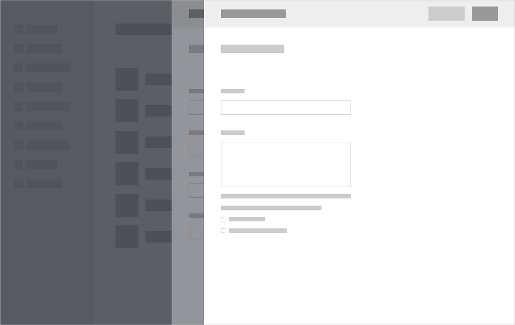
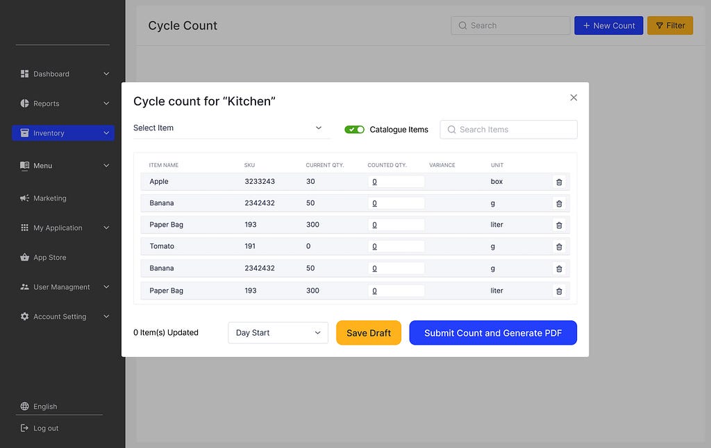
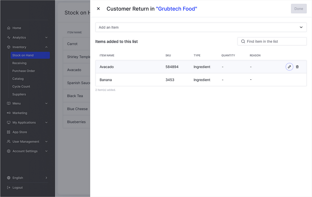
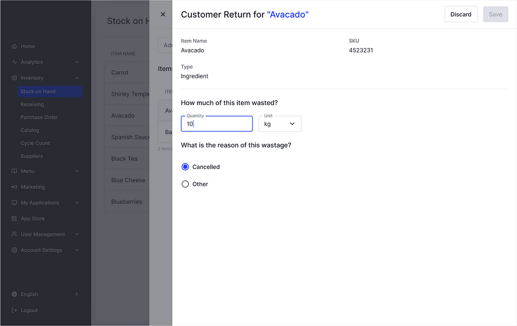
Our Solution: Stacked Drawers for Form Interaction
We redesigned the user flow to replace modals with a right-aligned drawer navigation system:
- When a user initiates a form (e.g., “Add Item” or “Edit Batch”), a drawer slides in from the rightIf additional nested input is required (e.g., adding a related item or extra step), a second drawer opens on top of the current one, without closing itThe user can go back one level at a time and always see the underlying context
This pattern makes the experience feel more linear and traceable, even when tasks are nested.
Key improvements in the drawer design:
- Step indicators at the top for long forms (e.g., “Step 2 of 4”)Clear close/back controls for each drawer levelLayered shadows to visually reinforce the depth hierarchyPersistent field states, so returning to a previous drawer retains user inputProper keyboard navigation and ESC support
We also updated copywriting and CTA labeling inside the drawers to ensure clarity (e.g., “Continue to Step 3” instead of generic “Next”).
Results & Feedback
After implementing the drawer-based UI, we conducted follow-up usability tests and compared key metrics:
- Task success rate increased by 27%Time to complete multi-step forms reduced by 19%Error rates (missed fields, abandoned flows) dropped by 36%9 out of 12 participants reported that they felt “more in control” during data entry
Internal teams also responded positively, particularly customer support staff, who found it easier to guide users through tasks over the phone using the new drawer-based flow.
What We Learned
This redesign highlighted the importance of context preservation, especially in complex data entry flows. While modals are useful for simple tasks, they don’t scale well when depth, flexibility, and memory are required.
The drawer-based solution gave us:
- A more structured and scalable interaction modelBetter spatial orientation for users during nested actionsMore room for longer forms and step-by-step guidanc
This solution is now being applied across other areas of the product with similar success.
Thanks!
I want to thank you for reading this case study. You can read more case studies from my Portfolio Website and please stay connected with me on Linkedin.
Enhancing Data Input with Layered Drawer Form was originally published in UX Planet on Medium, where people are continuing the conversation by highlighting and responding to this story.
