

The working title for this piece was “Why would The Browser Company build a boring browser?”
It’s a question we wrestled with early on in this journey.
How do you pair power with simplicity? How do you reinterpret creativity? What do you reinvent? When? And, maybe most importantly, why?
Nearly a week into Dia’s private beta, our very own Charlie Deets — former design lead on Apple’s Safari and product designer at WhatsApp and Facebook — shares our design team’s journey in familiarity, simplicity, and intentional novelty.
Let’s get in to it.
10am on a Tuesday Morning
For most people, switching browsers is a daunting task. People rely on their browser to get things done. They don't have the time to learn new workflows or risk being slower at their jobs.
Their life is what matters the most. If they don’t have their passwords, bookmarks, or can't find how to do a routine action, they will abandon the browser immediately.
While Dia is fundamentally a browser at heart, one of the things that makes it special is how it offers convenient access to your whole internet life as context for Chat. This is where Dia begins to really shine, deliver significant value, and become a product you can’t live without.
In order to give people the space to explore Dia’s novel value, we needed to get out of the way with the browser. The first objective of Dia’s design is to allow anyone to switch to Dia at 10am on a Tuesday morning.
Familiar, but elevated
We have been calling this “Tuesday morning” technique familiarity, and it is at the core of how we design Dia.
Whereas our first browser, Arc, unapologetically innovates on core browsing mechanics like the tab bar, bookmarks, and tab groups; Dia starts all core browsing features in a place where anyone who has used a browser before would immediately understand.
We take liberties with this principle by adding extra convenience and craft on top of familiar features. But we choose to do this only when it provides value above and beyond what a user is expecting — without diminishing the recognizable patterns that make Dia easy to learn.
We call this concept elevated. You can see examples of these design decisions throughout the browser’s UI.
Craft.
These may be small changes, but in aggregate, they meaningfully shift the experience.
We extend the color of the page up into the active tab UI to help reinforce the relationship between the browser and the tab contents.
We fluidly animate the most commonly used UI like the Assistant Bar.
Convenience.
With all our core browser features, we explore innumerable paths before settling on what often appears to be an obvious solution.
One example: the Bookmarks Bar. While we had many creative takes on a Bookmarks Bar, some of which we truly loved, we wanted to ship something no one would have to learn. Something people could use and feel comfortable with. The nicest version of that UI they had ever used.
Simplicity.
Another way we elevate Dia’s design is by avoiding duplicative UI elements in the interface: we believe there should be a single obvious way to accomplish any task.
This principle helps keep Dia simple and fresh in comparison to some of the more established competitors that support duplicative or legacy workflows.
We tend to err on the side of minimalism in the core UI, even if difficult to achieve:
We never show the user an update banner. We do this by aggressively updating when the application is backgrounded, not in use, or when the computer is asleep. We avoid user data loss by alerting the user to tabs that have incomplete input fields. This has been a challenging problem that required close collaboration between design and engineering.
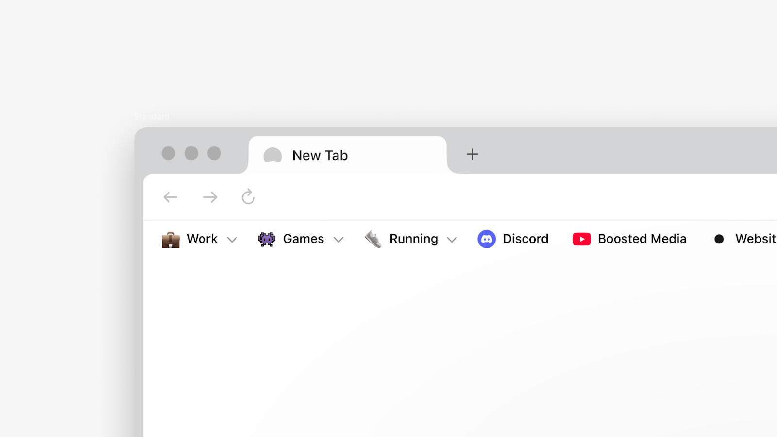
The bookmark button and site settings only appear when you hover over the URL. Rather than displaying these icons full time, we display them when the user is showing the intent to interact with the site. This helps preserve a sense of calmness in the core UI.
Profile selectors are only shown if you are actively using a profile. Most people don’t use profiles, but people who do desire them to be very prominent. We balance this by leaning into the polarized user needs.
Our navigation bar uses custom machine learning to route your input to a website, a Google search, a LLM-only result, or a LLM result that also uses and summarizes web data. You get the result you were looking for without thinking: it just works. This feature is critical to Dia’s experience and was again the result of close collaboration between engineering and design.
Finally, where we can, we try to humanize the browser UI and make it feel more approachable.
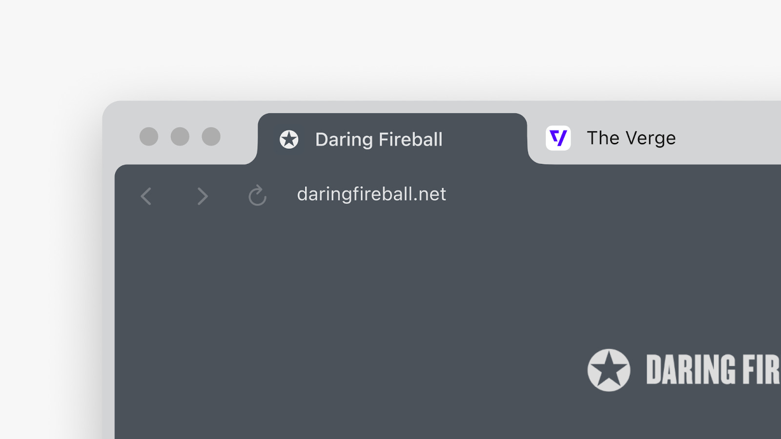
For example, instead of showing you a long URL string, in Dia’s URL bar we display the page title to help you recognize the page more clearly. The domain remains visible for recognition and security. We retain full URL functionality with this approach; when you hover over the bar, the URL is shown and you can edit it inline. We also provide users a view option who wish to see the full URL at all times.
The novelty budget
Every product has a novelty budget. This is how much effort people will put into learning something new in order to get value out of it.
In Dia we spend our novelty budget on our Chat features. To some degree, these are features where familiarity will not be as successful of a technique, because there are less established patterns for these actions.
One of our goals when designing novelty is to express the power available to you in your actions. We do this through the use of animation and color. While Dia’s overall design is quite restrained, in these moments we also aim to deliver our brand feeling through this UI.
In Dia, your Chats benefit from browser context. So we try to make the act of attaching relevant tabs as fast and obvious as possible. We do this primarily with a ‘mention’ interaction. We lean into the idea of familiarity through this behavior, as it is the same experience as tagging an entity on social media.
You can use the @ symbol in the input to reference tabs, history, bookmarks and more. You can also manually attach any of these references from the menu UI at the bottom left of the composer.

When you mention multiple tabs, we stack them in an animated pile at the beginning of a Chat. You can hover the pile and the attachments playfully animate. You can click to see all tabs revealed. The pile UI is mostly superfluous but aims to reinforce the value of adding context.

When you open the Chat sidebar, our brand animation swells into the view to remind you that you have the power of an assistant at your fingertips. This animation also helps communicate to the user that this is a fully integrated AI product and the page you are looking at will be used as context.
Skills are a feature of Dia that allow you to power up and personalize Chat responses. When we present you information through one of our Skills, we style it appropriately to help reinforce that you are actively using a skill.

In this example the ‘code’ Skill is showing you an answer with your preferences in mind. Skills are automatically invoked in response to your Chat messages, but we also allow you to manually invoke them using a slash command in any composer.

For those who want to personalize Dia further, we have the ability to create Custom Skills which can be accessed using the slash command anywhere in the product. This helps people who really want to customize and push the experience of Dia to the limits.
The future
We are up for some incredible challenges ahead.
One, it will be important in the near term to hold our principles of remaining recognizable and accessible as a web browser, while continuing to innovate and push forward new functionality with our Chat and Skills features. We want people to come to this product and feel comfortable, but also benefit from the innovation and features we are building. There will undoubtedly be tensions that arise because of this duality. Dia is meant to be a mainstream consumer product that anyone can use.
Two, we want to bring more of the functionality people love from Arc to Dia. Concepts like sidebar tabs, tab management and incoming link routing for profiles are high on our priority list. We don’t want to rush or copy and paste these features from Arc because we believe in approaching these problems through the principles of Dia and the new mechanics the technology enables.
Three, in the long run, our product strategy becomes less defined because we will need to adapt to the world and how people are using technology. Will a browser first experience be the right UI? Will the browser be an assistant to your Chat? We are going to pay very close attention to how people are using Dia and be unafraid to adapt quickly to new behaviors. We continue to assume we don’t know.
From the team that designed Dia and the entirety of The Browser Company, thank you for reading. We hope you will enjoy Dia and find it truly useful. We are always listening for feedback, so send it our way!
-Charlie
P.S. If you would like to try Dia, here is an invite link!
