
Covering what empty states are, their anatomy, common use cases, and different types with tips on when to use each.
Introduction
Empty states are often overlooked in product design. Although only an estimated 2–5% of users encounter them, well-designed empty states can improve usability, reinforce your brand’s personality, and create emotional connections with users.
In this article, we’ll cover what an empty state is, its typical structure, when to use it, and common design patterns you can use.
What is it?
An empty state is a UI screen or section that appears when there’s no data or content to display.
Anatomy
A well-structured empty state typically includes:
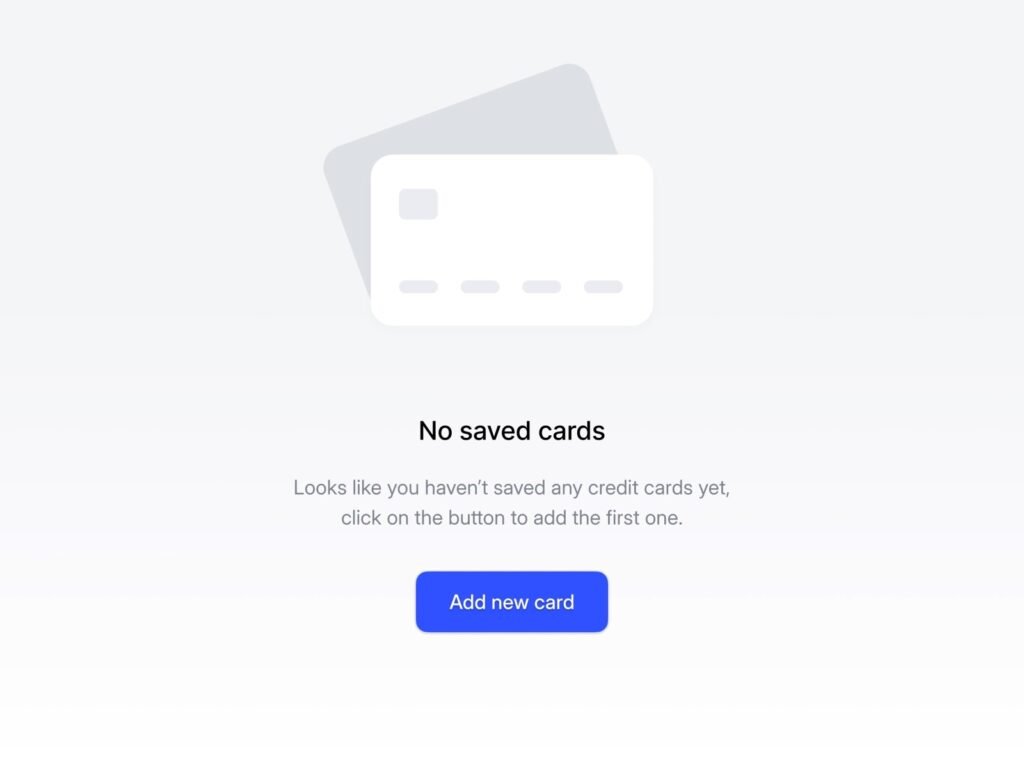
Visual (optional): An image or icon that draws attention to the empty area and visually reinforces the message.
Header: A short message that communicates the system status (e.g., “No saved cards”).
Explainer: A short paragraph that:
- Explains why the screen is emptyReassures users about what should be hereSuggests what they can do next
Action (optional): A call-to-action (CTA) to guide users toward populating the space or exploring alternatives.
Use Cases
Empty states can appear in the following scenarios:
- First-Time Use: When users are new and no data exists yet. Example: A new Dropbox account with no files.User-Cleared: When users delete, complete, or remove all items from a list. Example: A cleared inbox or task list.No Results Found: When a user’s filters or search query return no data. Example: Searching for hotel options and getting no results.Paywall: When content is restricted to a higher-tier plan. Example: Viewing usage analytics that are only available to premium users.
Types of Empty States
Fundamentally, an empty state should always explain:
- What’s happeningWhy it’s happeningWhat to do about it
However, there are a few types of empty state patterns to suit different use cases:
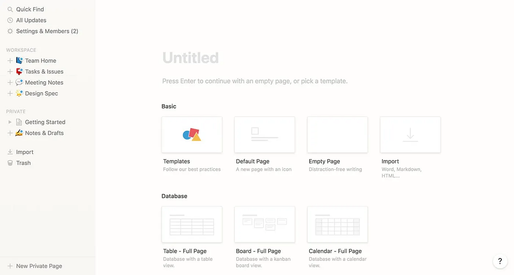
Basic Empty State
Use case: First-time use
Purpose: Explain why the screen is empty and guide users to take action.
There are 2 sub-use cases:
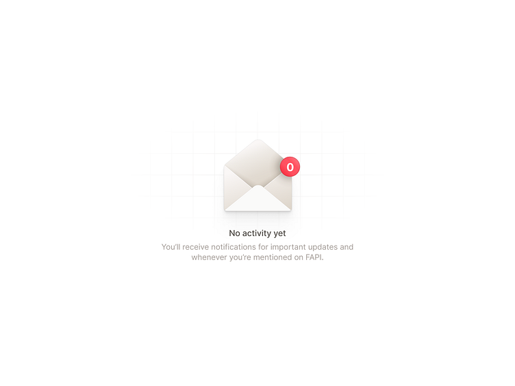
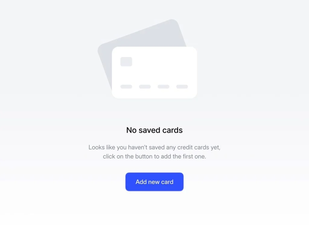
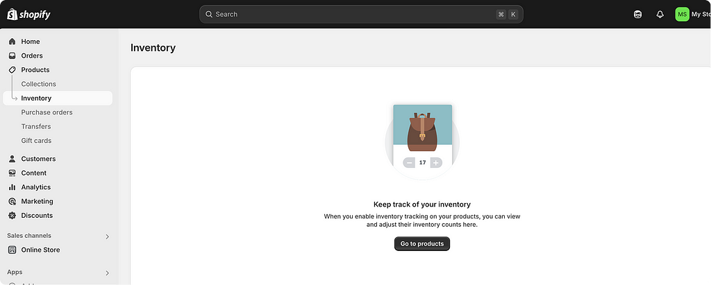
A) Pending User Action (common): The user needs to create content to fill the empty state.
Design tips:
- Introduce the section or explain what will be shown hereExplain the benefits to motivate usersProvide a CTA to help users take the first step
Example:

B) Pending System Update: The user created content, but pending system to display the data. For example, the system needs at least 24 hours to collect enough reliable data before it can populate a chart.
Design tips:
- Explain what’s happening and when content will appearNo CTA needed; ask users to return later
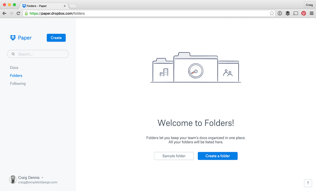
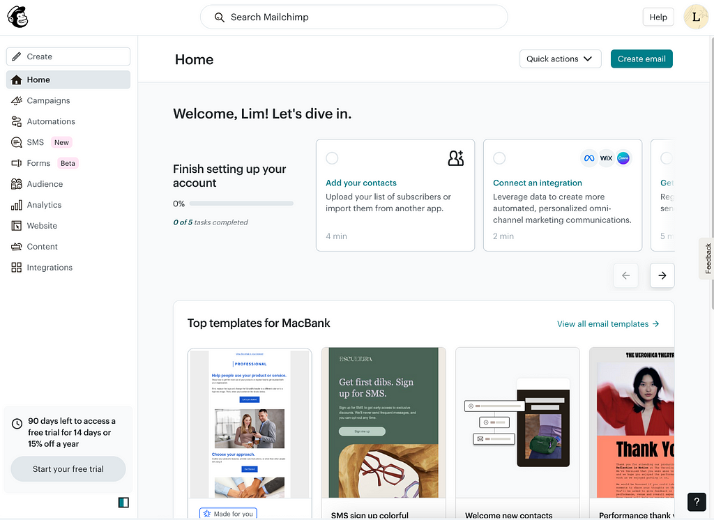
Starter Content
Use case: First-time use
Purpose: Educate users and help them explore the product.
Design tips: Provide starter content, dummy data or examples to encourage exploration through guided content.
Example:
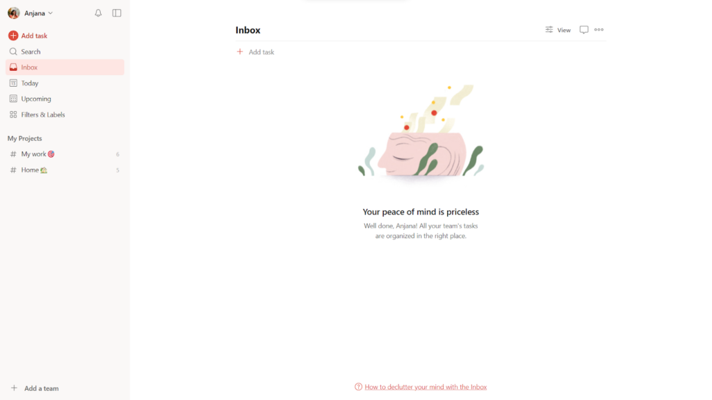
Zero Item
Use case: User-cleared
Purpose: Acknowledge user’s effort for completing complex tasks and create emotional satisfaction.
Design tips:
- Congratulate users for taking care of their jobs (e.g., “You’re all caught up!”)Consider using nature-inspired visuals (biophilia effect) to evoke calm and happiness; humans possess an innate tendency to seek connections with nature and other forms of life
Example:
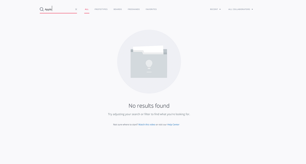
No search results
Use case: No result found
Purpose: Inform the user that no data is available, and guide them on the next steps to prevent frustration.
Design tips:
Explain no results were found, and suggest actions to address the issues:
- Trying different keywords or filtersUsing advanced searchViewing best matches (by expanding the range automatically and suggest other related results that might interest them)Visiting help resources (documentation, FAQ)
Example:
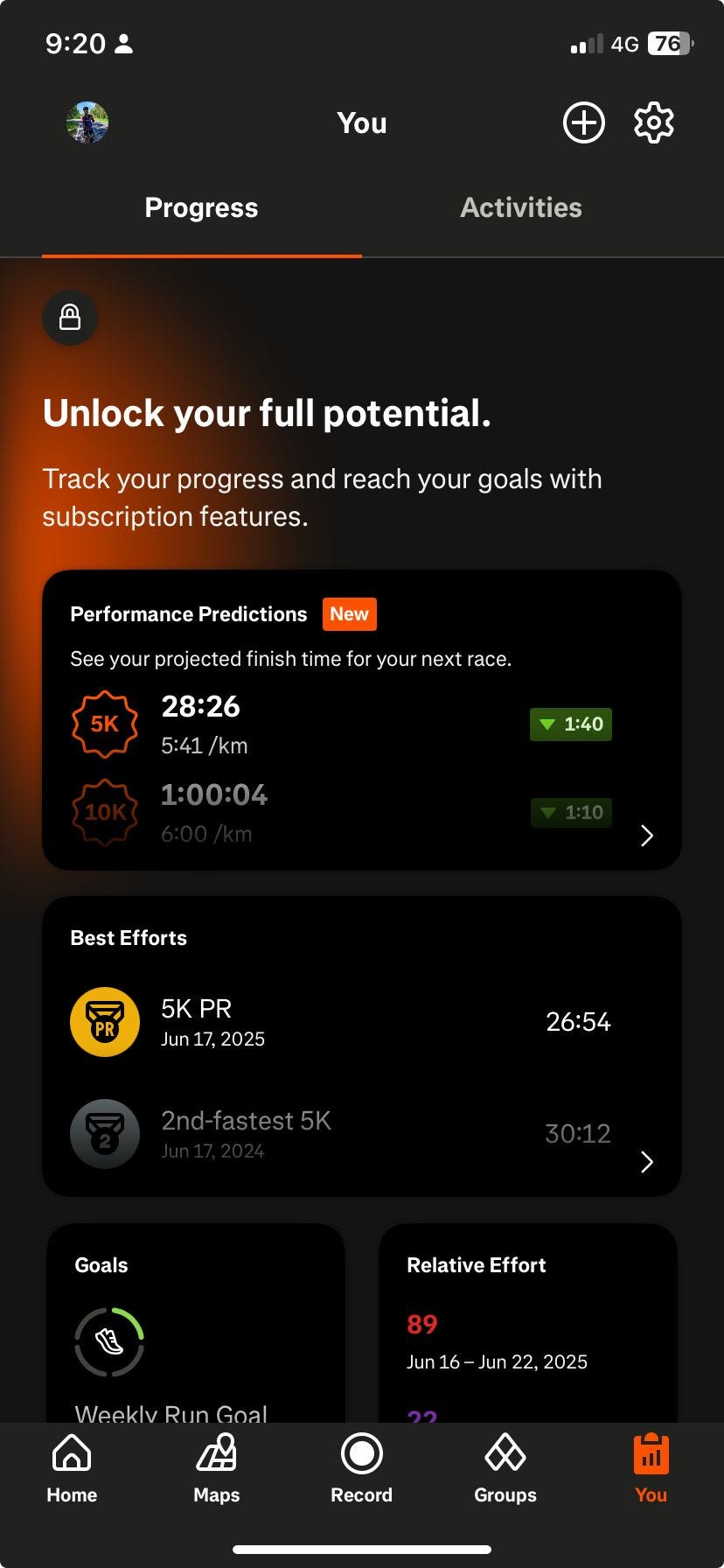
Paywall
Use case: Paywall — Content hidden behind a subscription
Purpose: Convert free users into paying customers
Design tips:
- Explain why the content is unavailableShow teaser data or summariesHighlight value of upgraded featuresInclude a CTA to upgrade
Examples:
Summary
- An empty state is a UI screen with no content or data.A good empty state includes a visual, a message, an explanation, and optionally a CTA.Empty states often appear during first-time use, when users clear data, when no results are found, or when content is gated.A good empty state design should always answer: What’s happening, why is it happening, what can users do next?Common patterns include: Basic empty states, starter content, zero items, no results, paywalls
Resources
- https://www.toptal.com/designers/ux/empty-state-ux-designhttps://app.uxcel.com/courses/common-patterns/empty-states-best-practices-330https://www.pencilandpaper.io/articles/empty-stateshttps://uxdesign.cc/7-types-of-empty-states-and-how-to-use-them-717006dfaa8ahttps://carbondesignsystem.com/patterns/empty-states-pattern/https://designsystems.surf/directories/states
Empty State Design: A Practical Guide was originally published in UX Planet on Medium, where people are continuing the conversation by highlighting and responding to this story.
