
Sticking with a single alignment (or as few as possible) helps to simplify an interface, making it look neater and tidier.
One of the trickiest and most important parts of UI design is aligning interface elements. Getting the alignment right can drastically improve aesthetics and readability.
The more different types of alignment you use (left, right, or centre), the more complex and messy an interface can look. Our eyes are forced to work harder as they move around to try and follow each alignment. This is highlighted when multiple different alignments are used within a small component or section of an interface.
Sticking with a single alignment (or as few as possible) helps to simplify an interface, making it look neater and tidier.
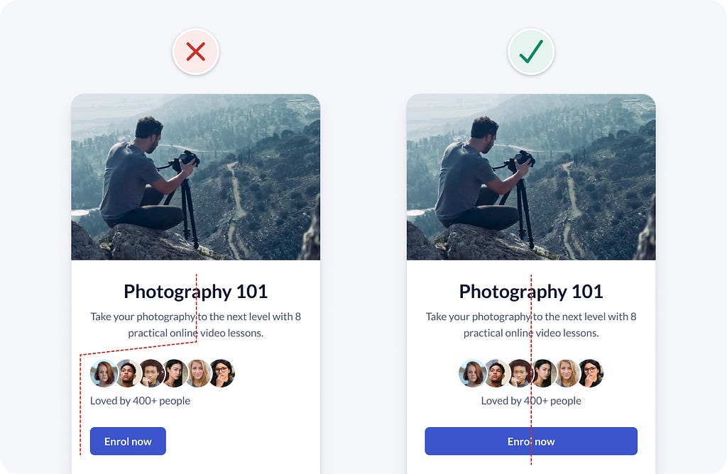
Example 1
The following example starts with centre aligned text, then changes to left alignment for the other elements. The mixture of alignments adds unnecessary complexity, resulting in slightly increased cognitive load and a less tidy interface.
It’s simpler and neater to left align all interface elements. The straight left edge also improves readability.
Since there’s only a small amount of text, you could also centre align all elements. Make the button full-width to help both left and right handed users easily reach it with one hand.
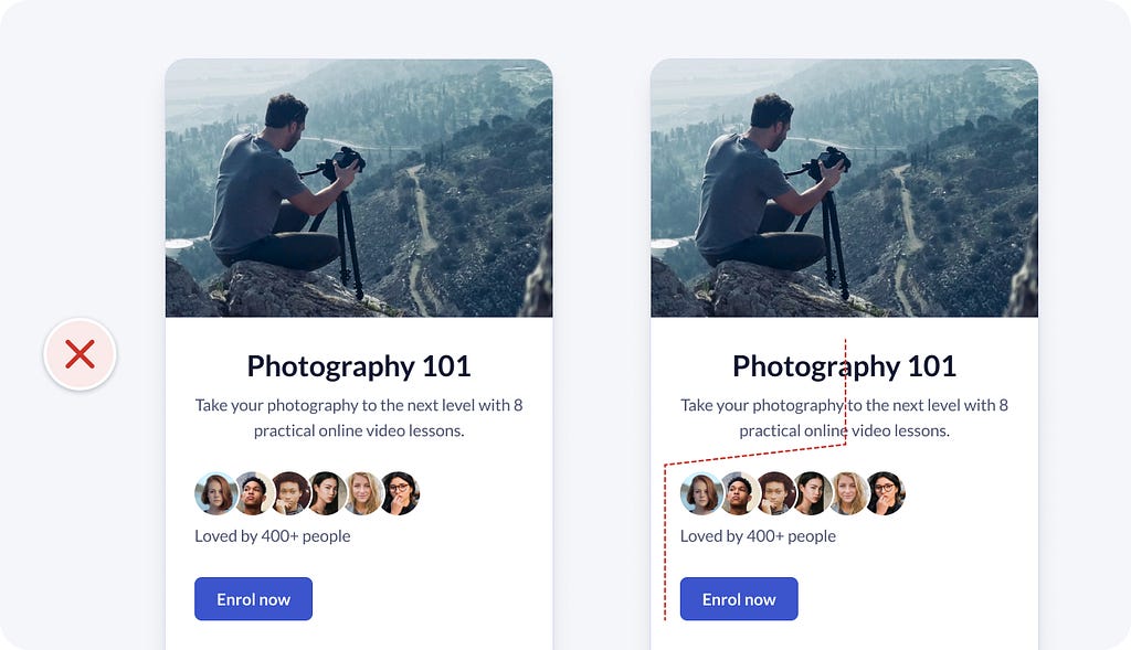
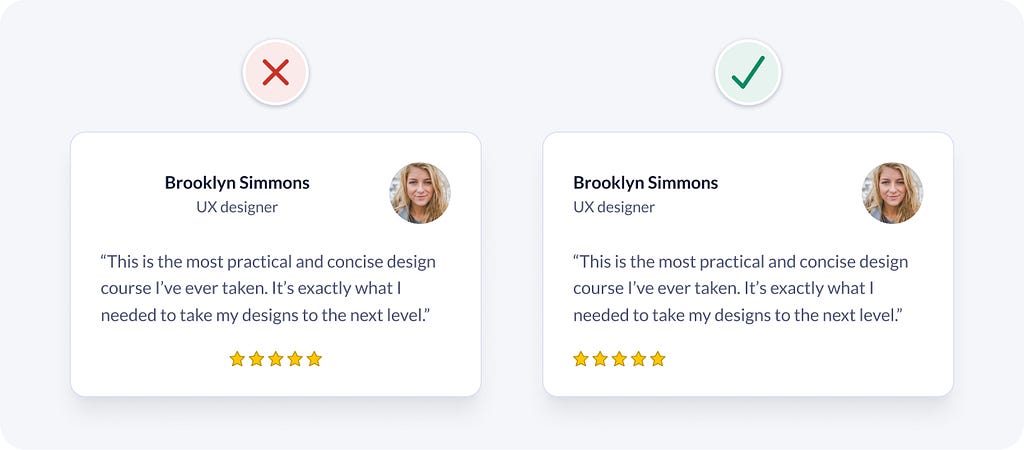
Example 2
Here’s another example that demonstrates how using fewer alignments can help simplify an interface. The person’s name and role are centre aligned, their photo is right aligned, the quote text is left aligned, and the stars are centre aligned. You can feel your eyes zig-zag as you view the information and it looks untidy.
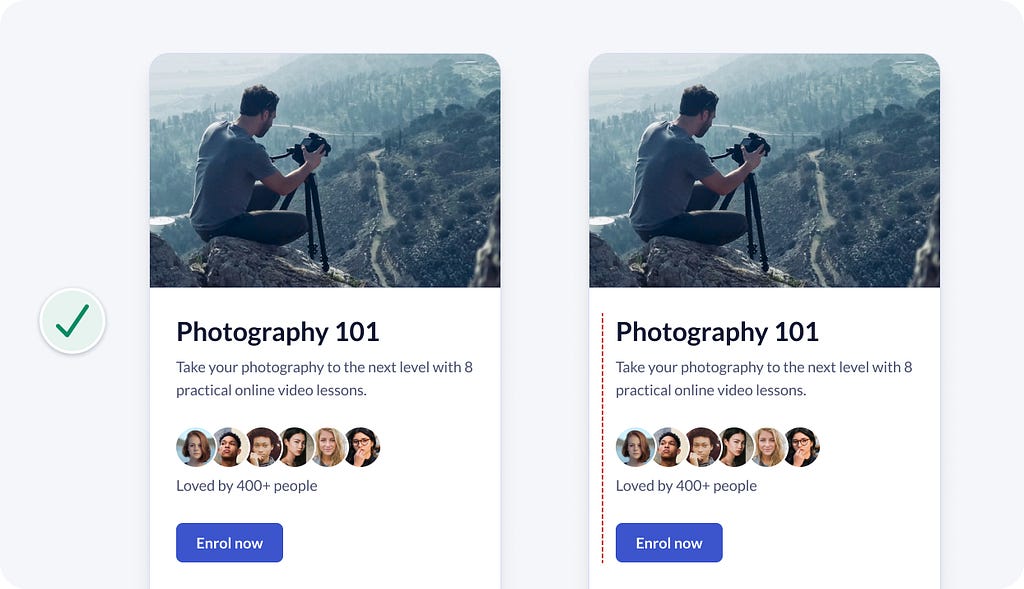
Aligning the majority of elements to the left is simpler and neater.
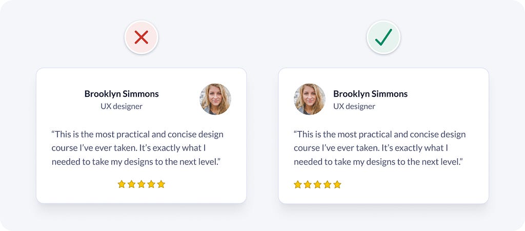
You could also improve readability by aligning all text to the left edge. The right aligned photo is ok, as the majority of elements have 1 alignment.
UI design doesn’t have to be so hard. Following a system of logical rules, like the one above, helps you efficiently make informed design decisions.
I hope you found this quick UI design tip helpful. I’d love to hear your thoughts and feedback.
Learn more practical UI design tips
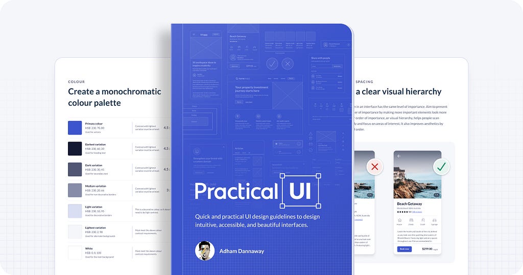
This is just 1 of over 100 logic-driven design guidelines from my UI design book. It’s helped hundreds gain years of experience in a matter of hours.
Elliot Rylands on Twitter: "I've just picked up @AdhamDannaway's new book. A must have for anyone of any level within #UX, #UI, #Product, & even #dev / #engineering. An excellent resource of #design principals that will be my point of reference from here onwards. Bravo Adham! https://t.co/WNvjB8g5iF / Twitter"
I've just picked up @AdhamDannaway's new book. A must have for anyone of any level within #UX, #UI, #Product, & even #dev / #engineering. An excellent resource of #design principals that will be my point of reference from here onwards. Bravo Adham! https://t.co/WNvjB8g5iF
PS If you found this article helpful, giving it a few claps 👏 would mean the world to me. Stay in touch by following me on Twitter and LinkedIn for daily design tips, tools, resources, and inspiration.
UI design tip: Try to avoid using multiple alignments was originally published in UX Planet on Medium, where people are continuing the conversation by highlighting and responding to this story.
