Material motion system, Sliders, ShapeableImageView, and more
This article is also posted on the Material Design blog.
We’re excited to announce the release of Material Components for Android (MDC-Android) 1.2.0! A host of exciting new features have been added along with many bug fixes and accessibility improvements. Get the rundown below.
Be sure to check out the release notes. If you’re using MDC for the first time, also take a look at our getting started guide.
What’s new in 1.2.0?
A fair bit has changed since we launched 1.1.0 in February — we added the motion system, slider component, a widget for image shape theming, and more. The things you loved from the alpha, beta, and RC releases of 1.2.0 are now officially stable. If you haven’t yet started using version 1.2.0 of MDC, there’s never been a better time to update.
Material motion
Material’s motion system includes a set of four transition patterns. They can help users understand and navigate an app, and reinforce relationships between components or full-screen views. The transition patterns are:
MDC 1.2.0 enables Material motion in your Android app. The four transition patterns are implemented as classes built on top of both the AndroidX Transition library (androidx.transition), available in the com.google.android.material.transition package, and the Android Framework Transition library (android.transition), available in the com.google.android.material.transition.platform package. They can be used to transition between Fragments (including Jetpack Navigation), Activities, and Views.
Container transform between Fragments (using Jetpack Navigation)
<!-- fragment_a.xml -->
<View
    android:id="@+id/start_view"
    android:transitionName="start_container" />
<!-- fragment_b.xml -->
<View
    android:id="@+id/end_view"
    android:transitionName="end_container" />
// FragmentB.kt
override fun onCreate(savedInstanceState: Bundle?) {
    super.onCreate(savedInstanceState)
    ...
    sharedElementEnterTransition = MaterialContainerTransform()
}
// FragmentA.kt
fun onCreate(savedInstanceState: Bundle?) {
    super.onCreate(savedInstanceState)
    ...
    exitTransition = Hold()
}
...
val directions = FragmentADirections.actionFragmentAToFragmentB()
val extras = FragmentNavigatorExtras(startView to "end_container")
findNavController().navigate(directions, extras)
Shared Z-axis between Fragments
// FragmentA.kt
override fun onCreate(savedInstanceState: Bundle?) {
    super.onCreate(savedInstanceState)
    ...
    reenterTransition = MaterialSharedAxis(
        MaterialSharedAxis.Z, /* forward = */ false)
    exitTransition = MaterialSharedAxis(
        MaterialSharedAxis.Z, /* forward = */ true)
}
// FragmentB.kt
override fun onCreate(savedInstanceState: Bundle?) {
    super.onCreate(savedInstanceState)
    ...
    enterTransition = MaterialSharedAxis(
        MaterialSharedAxis.Z, /* forward = */ true)
    returnTransition = MaterialSharedAxis(
        MaterialSharedAxis.Z, /* forward = */ false)
}
Fade through between Fragments
// FragmentA.kt
override fun onCreate(savedInstanceState: Bundle?) {
    super.onCreate(savedInstanceState)
    ...
    exitTransition = MaterialFadeThrough()
}
// FragmentB.kt
override fun onCreate(savedInstanceState: Bundle?) {
    super.onCreate(savedInstanceState)
    ...
    enterTransition = MaterialFadeThrough()
}
Fade a target View (using TransitionManager)
val fade = MaterialFade()
TransitionManager.beginDelayedTransition(container, fade)
view.visibility = View.VISIBLE // Use View.GONE to fade out
Learn more about how to implement motion for Android.
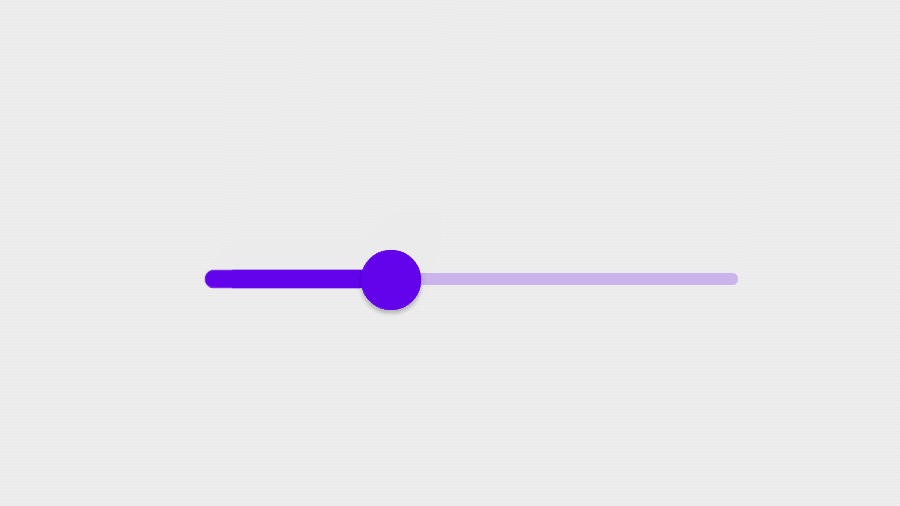
Slider
Sliders allow users to make selections from a range of values. They are ideal for adjusting settings such as volume, brightness, or applying image filters.
MDC 1.2.0 allows you to use sliders in your Android app with the Slider and RangeSlider widgets. They’re similar to SeekBar but have additional features and support Material Theming.
<!-- In layout -->
<com.google.android.material.slider.Slider
    android:id=”@+id/slider”
    ...
    android:valueFrom="0.0"
    android:valueTo="100.0"
    android:stepSize="10.0" />
    ...
<com.google.android.material.slider.RangeSlider
    android:id=”@+id/rangeSlider”
    ...
    android:valueFrom="0.0"
    android:valueTo="100.0"
    android:stepSize="10.0"
    app:values="@array/initial_slider_values" />
<!-- In res/values/arrays.xml -->
<resources>
    ...
    <array name="initial_slider_values">
        <item>20.0</item>
        <item>70.0</item>
    </array>
</resources>
// In code
slider.addOnChangeListener { slider, value, fromUser ->
    // Respond to change in slider's value
}
...
val values = rangeSlider.values
Learn more about how to implement sliders.
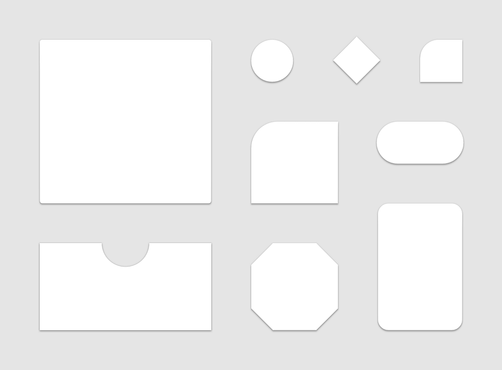
ShapeableImageView
The new ShapeableImageView widget is an extension of AppCompatImageView which understands shape theming. A common use case is to apply circular clips to rectangular source images. However, it also supports varying corner sizes, cut corners, as well as different stroke widths and colors.
<!-- res/values/shape.xml -->
<style name=”ShapeAppearanceOverlay.App.CornerSize50Percent”
    parent=””>
    <!--
    Sets size of corners to be 50% of min(width, height) of widget
    -->
    <item name=”cornerSize”>50%</item>
</style>
<!-- res/values/styles.xml -->
<style name=”Widget.App.ShapeableImageView”
    parent=”Widget.MaterialComponents.ShapeableImageView”>
    <item name=”shapeAppearance”>
        ?attr/shapeAppearanceSmallComponent
    </item>
    <item name=”shapeAppearanceOverlay”>
        @style/ShapeAppearanceOverlay.App.CornerSize50Percent
    </item>
    <item name=”strokeWidth”>1dp</item>
    <item name=”strokeColor”>?attr/colorPrimary</item>
</style>
<!-- In layout -->
<com.google.android.material.imageview.ShapeableImageView
    ...
    style=”@style/Widget.App.ShapeableImageView”
    app:srcCompat=”@drawable/image” />
MaterialColors
The MaterialColors utility class was made public in MDC 1.2.0. It gives you a variety of useful static methods to use when dealing with colors programmatically in your app.
// Resolve color from theme attr
val primaryColor = MaterialColors.getColor(
    view, R.attr.colorPrimary)
// Layer background color with overlay color + alpha
val overlayedColor = MaterialColors.layer(
    view, R.attr.colorSurface, R.attr.colorPrimary, 0.38f)
Support for materialThemeOverlay in all components
The materialThemeOverlay attribute allows you to apply theme overlays. Unlike android:theme, it can be used in default component styles (e.g., materialButtonStyle). By default it can only be used with MDC; full support for all components was added in 1.2.0. You can use MaterialThemeOverlay#wrap to add this functionality to custom views.
MaterialButton respects android:background
MaterialButton previously ignored custom background drawables applied with android:background. This has been fixed in MDC 1.2.0. A MaterialShapeDrawable will still be used as the default background if no custom background is set.
Note: The default style for MaterialButton includes a backgroundTint which will also be applied to a custom background drawable. You may need to change this to a different color or set it as @empty to remove it.
<!--
Note: Button is auto-inflated as
MaterialButton by MaterialComponentsViewInflater
-->
<Button
    ...
    android:background=”@drawable/custom_background”
    app:backgroundTint=”@empty” />
What’s next for MDC?
The next feature release of MDC— 1.3.0 — is well underway with multiple alpha releases out at the time of writing. Exciting new updates include ProgressIndicator, MaterialTimePicker, and various improvements to existing components. As always, we encourage you to file bug reports and feature requests on GitHub. Also be sure to check out our Android example apps and how to Build a Material Theme.
We highly encourage trying out MDC 1.2.0. If you’re using its features in your Android app, leave a comment below or reach out to us on Twitter @materialdesign. We’d love to see it.
Material Components for Android 1.2.0 is now available was originally published in Google Design on Medium, where people are continuing the conversation by highlighting and responding to this story.