
(and Practical Ways to Ease the Pain)
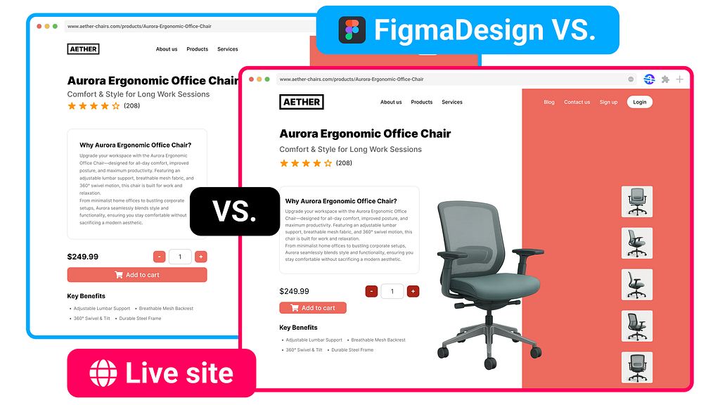
“It’s only two pixels off, no one will notice.”
I’ve heard that sentence whispered at 1 a.m. more times than I’d like to admit. And every time, it lands like fingernails on a chalkboard. Because those “only three pixels” gradually pile into an interface that feels… slightly off. Users don’t file bug reports about it, but they feel it — and so do we.
After fifteen years hopping between design systems, dev stand-ups, and last-minute launch scrambles, I’m convinced design-to-dev QA is still one of the most underestimated bottlenecks in digital product work. We pour weeks into meticulous Figma files, yet the last mile between mock-up and production code keeps tripping us up.
This is an honest autopsy of why QA hurts and how teams can start healing it — today — without buying more software (though new approaches are brewing).
The Quiet Cost of “Close Enough”
A mis-sized button or missing hover state rarely breaks a feature, so they slide into production. But enough “close enough” decisions create:
- Brand erosion: Colors shift, headings wobble, the product stops feeling cohesive.Cognitive tax: Users subconsciously work harder to parse layouts that don’t align.Team fatigue: Designers chase tiny fixes; devs context-switch from new features to pixel tweaks.
Multiply that over sprints and you’ve accumulated design debt, expensive to pay down and lethal for trust.
How Did We End Up Here?
- Tool fragmentation: Figma → Slack → Jira → Google Docs → Browser DevTools . Every handoff hop is a chance for context to drop.Time pressure: The sprint ends Friday, QA catches issues Thursday; suddenly quality feels optional.Different mental models: Designers think in visual hierarchy; developers optimize for code reuse, performance, browser quirks. Each side assumes the other “gets it.”No single source of truth: Once code forks from design, nobody knows which reference is canonical.
Once code forks from design, nobody knows which reference is canonical.
The Screenshot Ping-Pong Cycle
If your review process looks like this, you’re not alone:
- Designer screenshots staging site, overlays in Figma, annotates misalignments.Dev receives Slack message, Word/Google docs (or worse, email).Dev fixes some items, replies “done.”Designer double-checks, finds two new breaks introduced by the fix.Repeat until morale drops.
Five Friction Points That Sneak Into Every Handoff
1. Vanishing Hover/Focus States
Why It Happens: Specs hidden in nested Figma variants.
Quick Mitigation: Add state checklist to PR template.
2. Off-brand Grays & Blues
Why It Happens: Dev eyeballs color; monitors calibrated differently.
Quick Mitigation: Abstract tokens ( --color-primary) directly from design system.
3. Padding Guesswork
Why It Happens: Framework spacing scale ≠ design’s 8-pt grid.
Quick Mitigation:Map design tokens to utility classes early.
4. Missing Error Messages
Why It Happens: QA scripts test success path only.
Quick Mitigation: Write test cases for every UI state, not just happy flow.
5. Copy Drifts
Why It Happens: Marketing updates Figma text after dev starts.
Quick Mitigation: Freeze copy at dev kickoff; track changes in one doc.
What “Good” Design QA Looks Like
- Single shared checklist: Typography, spacing, colors, interaction states, accessibility. One doc, version-controlled.QA mid-sprint, not post-build: Designers review feature branches before code merges to main.Live, side-by-side comparison: Whether two monitors or an overlay tool, reduce tab-switching.Pair reviews: 15-minute designer–dev walkthrough beats 60 comment back-and-forth.Automated sanity checks: Lint color tokens, snapshot diffs for layout regression, accessibility audits.
Small Experiments You Can Run This Week
- “Micro-QA Fridays”: Block 30 mins for designers to scan staging with devs present on a call. Fixes happen live.Shared Color Tokens: Export your design palette as CSS variables and import into codebase.State Matrix: For each component, list default / hover / active / disabled / error. Treat missing states as bugs.PR Checklists: Add a “design match confirmed” checkbox developers must tick before merge.Feedback Inbox Zero: Choose a single channel (e.g., Jira label design-qa) and forbid screenshots in Slack threads.
Looking Ahead
I’m experimenting with a browser-first workflow that lets you overlay designs on live code, leave comments in-place, and track fixes without the screenshot shuffle. It’s still early, but the goal is the same as the tips above: keep context where the work happens.
Was This Helpful?
If design-to-dev QA pains you too, I’m publishing more hands-on guides, checklists, and case studies. Follow my Medium profile or sign up to my email updates to swap stories and tactics as this journey unfolds.
Pixel-perfect might be a myth, but friction-free QA doesn’t have to be.
Thanks for reading, and let me know in the comments: what’s your team’s biggest QA hurdle right now?
Why Design-to-Dev QA Still Stings was originally published in UX Planet on Medium, where people are continuing the conversation by highlighting and responding to this story.
